Skip to content
A Case Study
Before we start I want to show you some images. You can also click on these links to read definitions on very important terms: original, average & version.
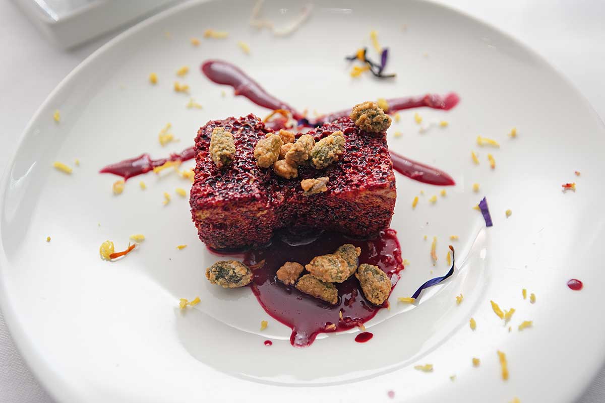
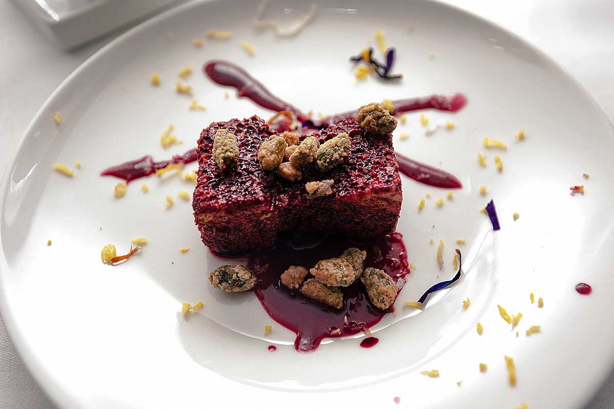
Let’s start by reading and analyzing the original. What do you think about it? I think it is good original(I cherry picked something easy for this page). The plate is not neutral could be brighter, whiter. The dessert shows much detail, and at the same time is quite color. Will it be necessary to choose between these two?
Original
An image that has not been edited, manipulated or altered in any way. In the Workshop usually is in RAW format, but sometimes also JPG serves a purpose.
Average
The mathematical average of all versions color-corrected from the Panel. It has a very high learning value, especially for color and textures (like noise).
Extras
Sometimes I present my own version, other times we already have versions available. For difficult or professional images I look on the web for examples.
Before We Start
Color correction and post-production are disciplines based on two very different sets of rules, at the same time. “Correct” and “beautiful” are two very different goals, as are the paths to achieve them. Finally, the professional field has very specific needs and requires different workflows. Photojournalism, for example, has a rigid ethical code that needs to be respected, whereas marketing is chasing different results, in very different ways.
Objective Correct
Easy: the image above shows you at the same time the original on the left, and on the right a corrected version. It is acceptable that someone may prefer the aesthetics of the image on the left, but the one on the right is just correct. Rocks are not blue anymore, for example. We can be sure measuring the greys that were slightly green in the original, and are now neutral. Also saturation, contrast and brightness are all well balanced.
Objective & Subjective
Let’s try to differentiate our readings, our evaluations. One, objective, almost numerical, that weights and measures if a result is correct. And the second, more volatile, deeply linked to aesthetic (and thus liable of several interpretations, cultural differences and personal tastes) in where we voluntarily sacrifice one or more correct elements to achieve a results that is more beautiful to us. Let’s see two examples.
Subjective Aesthetics
Difficult: two different versions compared. Now one is not unmistakably wrong. We have two acceptable results. On the left we have more chromatic variation, more details more contrast. But the colorist on the right chose to impose a precise chromatic cast, it looks almost a duotone. A polarising result that will never please everyone, if not for very precise applications.
Back To Our Example
The Original
Raw & Jpg Reading & analysis
Every good workflow begins with a quick but comprehensive analysis of an image best elements and faults. It can be also important to define the elements that this photo contains. For example here we have a dessert, and a plate (it is possible to see more, but it is not important). Now we can ask ourselves: what is wrong in this image? How do we fix it?
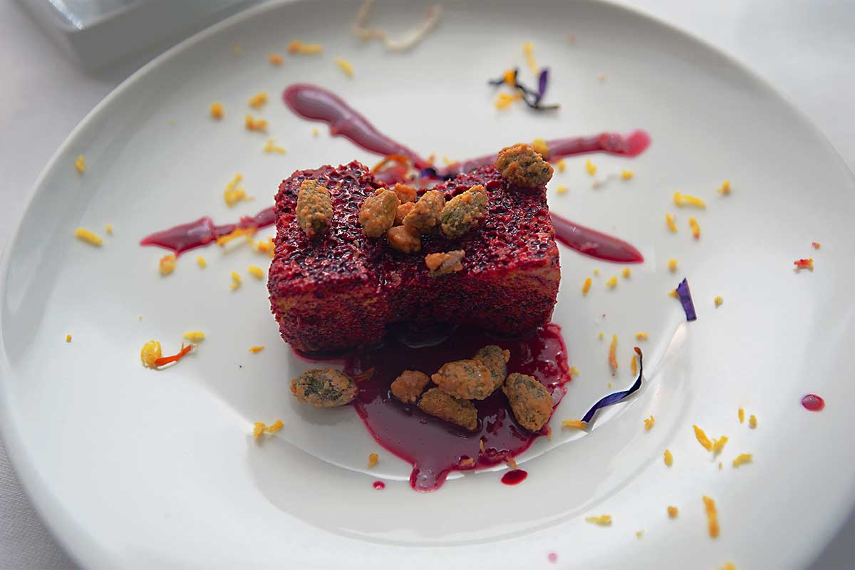
The Average Version
In my Workshop’s video the first comparison is always with the average. This is almost all the time better than the original, and our dessert is no exception. On the right the color cast on the plate was removed, colors and saturations were improved, details, in both highlights and shadows were improved. But I also think we can do more. Let’s not forget this is an average of works of different colorists, as such mistakes are mellowed but so are the best ideas.
Contrast Or Saturation?
Analysis And Research, Applied Exploring different paths
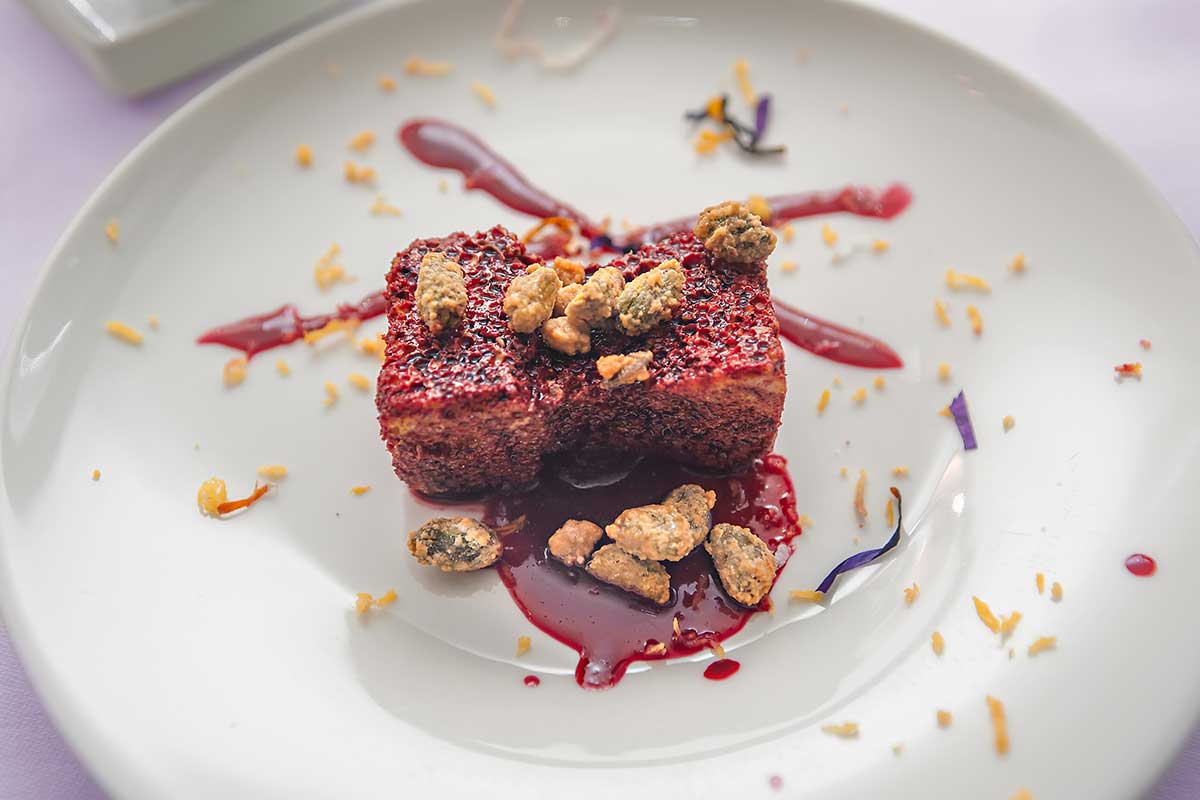
Let’s now consider two Panel’s different versions. From now on, it will very difficult, perhaps impossible, to be entirely objective. We can use our observation and analysis skills to look for answers. But we also want to be honest about our aesthetic values. And this is double edged swords, as these depends on our location, culture and education. On the left we can see a correction that focus on contrast, on the right it’s about saturation. The plate is better on the left, in my opinion, but on the right the dessert is more prominent. Still, we yet to ask the most important questions: who is our client? What purpose this image will serve?
Interpretation Or Correction?
Results & Aesthetic Evaluation and final results
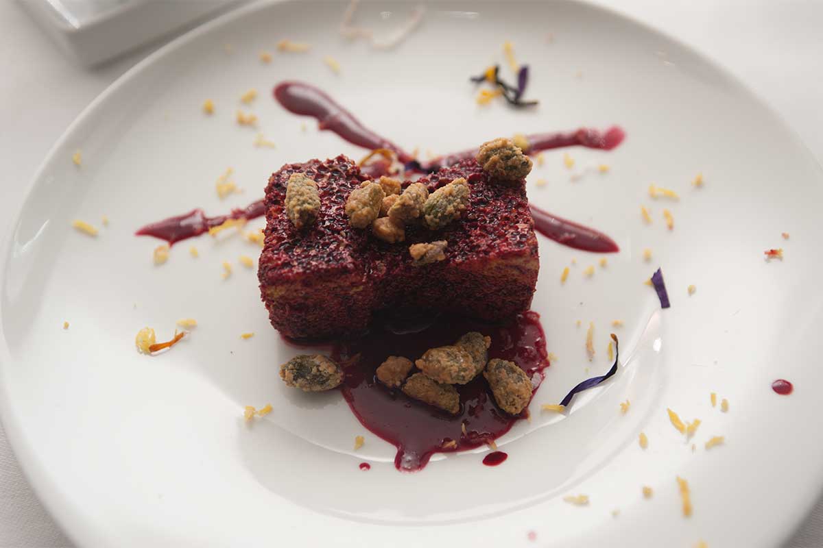
By reading, comparing, and choosing what we think is better in every single image challenge we extend and deepen our culture, our aesthetic education. And by understanding what we like more, we shorten our decision-making times when we work on images. Here, on the left our colorist chose to force a color in the tablecloth that can nicely compliment the dessert. We call these family of retouching interpretation, more personal, and risky, approaches than corrections like the one on the right, still the best version of this original.
A modern and advance method to read an original, and analyse an image, based on Lightroom (or other RAW processor). In Photoshop we can measure colors, but in Lr we can continuously change all the parameters to see how the image react to these changes. This way we can rapidly collect info not only on the image’s issue, but on its potential as well. We can couple this with the tool “Snapshot”, to create further references to compare.
The biggest problem for users that approach post-production and color correction is not about techniques, or tools, is about image analysis. Readings is a feature of the Online Workshop, is a video where I comprehensively analyse an original un-retouched image, its flaws and potential and how to approach its enhancement.
An absolute genius, and a great friend. Davide has a large and meaningful experience in many high end professional niches. He’s a brilliant coder, and build several Photoshop extensions. He wrote, as well, several books to learn to extend Photoshop. To add insult to injury is an incredibly talented colorist as well.
A “version” is an image that has been corrected by a colorist. In our Workshop a version is produced by every colorist, every week. It has a great value, but it gets multiplied when used in combination with other versions. Even if your working solo, producing more versions of the same original, can help you producing a better result.
An “original” is an unretouched image. Usually in RAW format, it can also be in JPGs as some professionals working in the field have severe time, hardware limitations.
A general understanding of how our visual system works is important for any colorist. The visual system is not limited to our eyes, the brain plays an important role. This combination, and the results they produce, was tweaked during our evolution to serve a purpose. Some of its phenomena can be proficiently used in color correction to our advantage.
From the Academy
More on this:
The Vault is our archive, it contains all our work, it is indexed, classified and archived with several rules.
The Workshop‘s users are a legitimate Team. In years of practice, work and discoveries we distilled a common language and refined our skills. We inspired each other with smart ideas and unconventional approaches. But most of all we disagreed. Agree with each other is a good thing, but disagreement is even better. The Team corrected hundreds of images for years, and it is always invited to share feedbacks and thoughts.
A core quality, like contrast and brightness, for every colorist. As such, one of the key parameters to evaluate in a corrected version. When we talk about saturation we mean a certain hue‘s intensity. When saturation get higher colors are more vivid, when it approaches zero hues turn to grey. Often words like “vivid” or “strong” are overlooked in color science, but are still valuable to us. Especially when we remember ourselves how much important perception is in our field.
The most important technology that we got when digital imaging switched to digital. Developing a RAW file means first and foremost that we’re not actually modifying that file in any way. We are working on a different text file, or database. This is also why RAWs are called “digital negatives”, because they will stay there untouched. It is the closest stage we can get to raw data from the sensor. There are also downsides, for example each manufacturer chose a different way, and extension, and there are significant variations in different softwares.
A new tool introduced in Camera RAW and Lightroom that allows user to subtract on a layer-based logic. It acts only on local adjustments subtracting the unwanted areas of brushing and filters. It has a great importance in lessening Photoshop usage, and it is the first step towards the end of the Lightroom Photoshop dualism.
An application published by Adobe in 1990 for Mac that allowed primitive (but jaw-dropping back then). Pleasure and pain of any digital photographer, colorist, pre-press manager and hundreds of other professions, from architecture to web design. Once sold as a stand-alone application, or bundled in the Creative Suite, it is today available only via a monthly or yearly subscription. It has always been the most pirated app in the world, and one that was developed without care or vision. So many, and diverse, tools were added during the decades, that an organic and comprehensive study is now impossible.
A RAW developing application published by Adobe since 2007. Lightroom was developed around the photographers but it still requires Photoshop for a complete color correction workflow. It is divided in modules, and can be used to manage catalogues, archives, metadata, editing, post-production and exports. Since the switch to the subscription model Lightroom is part of Creative Cloud.
Our collecting, analyzing and tweaking data received from our senses. We are not capable to make absolute measures, but we are very good at comparing things. visual system and color perception are good topic for colorists to learn to add a layer of complexity to their work.
From the Academy
More on this:
MVP, or “Most Valuable Player” is a term I took from the N.B.A. (huge fan) that is assigned to the best player on the field. In this Workshop the MVP is the Panel’s member with the most winnings.
A word that represent different things in the color correction world. A quality, a parameter, a channel in Lab, one of the two fundamental elements of a photo (the other is chroma). It is a core concept during the evaluation of a correction. It is a much more appropriate term when describing what was the exposure in a previous stage.
Let’s start from the start! Alessandro Bernardi, or AB (all acronyms in this page are friends, classmates and colleagues). A professional colorist, with a huge experience, he studied oversea with Dan Margulis, and from 2009 managed his classes in Italy. I, and many others, owe him a great debt of gratitude. The education, experience, and networking those classes generated changed many lives, mine included.
My opinion is that it is better to split color correction results in two categories: “corrections” and “interpretations”. Interpretations have a much more complex goal than corrections. They focus more on aesthetics, on subjectivity, their goal is to make a picture (or one of its element) to looks “better”. This can’t be absolute, and we risk, sometimes, to achieve the opposite result. Post-production for fashion photography, portraits and product photography usually are interpretations.
Let’s keep this simple. Hue define the kind of color we’re seeing, not how much is bright or saturated. So a saturated red, and a pale red will have the same hue, and different saturations. While a crimson red, a cardinal and a carmine will have similar hues, and different luminosities. Finally, greens and reds will have different hues. In digital color Hue can be a parameter in a color space, combined with Saturation and Lightness.
Duels is the last tool I developed. It allows you to challenge the Winner of a previous assignemt from a pool of over 300 images. You can comper your own version with the Winner’s, with the Average, and the Original. When you want, how many times you want.
My opinion is that it is better to split color correction results in two categories: “corrections” and “interpretation“. Corrections focus on objectively improving an original. Removing issues like color casts or lack of contrast, and improving saturation. It should be the first step in any job, and it should be the goal of photojournalism or scientific images. This required precision can, sometimes, make things harder, like in multi-images projects.
A core quality for colorists. As with many concepts in disciplines that involve perception it is much easier to observe the changes than to give a definition. If we increase contrast highlights will be brighter and shadows darker, if we reduce it the opposite will happens. Its definition, the relationship with dynamic range and the analogies with other disciplines require much more time and space.
The most important feedback we can have happens when we compare two version of the same image. We’re not able to measure colors with our eyes, but our visual system can compare things very quickly, and we can gain great value in this comparison. What works better, if there is a color casts, paired with tools to read color values we can safely tell the quality of our work.
Professionals in the fields of color correction. It is a quite definite subset of pros, like retoucher, or post-producers. Once (film age) a very prestigious career, with the transition to digital its value was diluted and quickly forgotten. Learning color correction is frequently mistaken with studying Photoshop, or other image processing applications. That couldn’t be more wrong.
(in progress) A comprehensive collection of videos, that has the purpose of introducing, training and advancing your color correction skills.
Color, limiting this definition in regards of our professions and studies, is our perception of the macroscopic manifestation of physical properties in everything around us. Our visual system is based on perception, and evolved for hundreds of millennia with a purpose: surviving. Studying this phenomena can be rewarding, like in the case of chromatic operation, or adaptation.
More on this:
Once the the line that divided pros from amateurs this still relevant color method is used less and less day by day. The importance of having four more channels will always be the same, but the more modern RAW tools (and the huge amount of time required to learn Photoshop ‘till CMYK), and the better quality we get from digital cameras, allows for much simpler and faster tools.
One of the fundamental elements that compile a digital image. Channels are usually three (RGB, Lab) or four (CMYK), and they are very valuable in practical color correction as well. They are essentially black and white versions of an image (where black and white values depends on colors), thus are great for masking, or reading an image.
Different sets of calculations that allows for different interactions of two adjacent layers. We can set the blend mode of a layer, adjustment layer or smart object, the result will impact luminosity, color or both. There are as well some primitive logic functions, like “difference”.
More on this:
Our visual system and our color perception will always be more advanced than a camera. Sure, there will be hardware capable of features we can compete with (it is already like this with night vision), but these usually involve peculiar hardwares and algorithms that do not produce good, nor natural, images. The power our brain has to manipulate colors will probably never be matched by a sensor. This is why many times there is no match in what we see, and what our camera sees, forcing us to operate a balance.
Photography’s original language (although imposed by technical limitations). Still doable, but massively penalized by digital, black and white is actually a very difficult language to recreate. Similarly to the imitation of gold on paper, todays colorists fail to understand a good old-fashion black and white print used many technologies not available anymore. A huge market, not always honest, gravitates around B&W, from grains to apply, to filter to auto-generate corrections. The best approach is still understanding how a color image is created, and to use its channels.
My favourite Photoshop tool is also a long forgotten one. I will write a complete article soon, in the meantime let me say blend-if is the most powerful tool to blend two different layers, allowing logical operations, especially when used in Lab. It is as well a tool that can be used in combination with masks, blend modes and opacity. What used to make Photoshop truly essential, at least until Range Mask came out in Camera RAW, and Lightroom.