The core experience in the Workshop is the correction of the images. In this page my evaluating and picking criteria.
In every discipline we can push ourselves to become better in areas we prefer, or like more. In color correction extending our own preferences, and working on lesser known kind of photography, has a huge learning value. It teaches us to solve specific sets of issues, widening our set of tools, our culture, and imagination. For each kind of photography you can also find a professional that I currently follow.
Four Main Classification Criteria
EasySimple
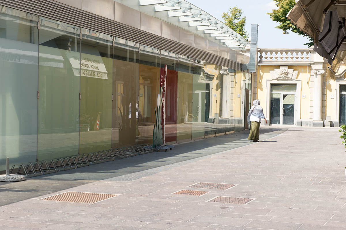
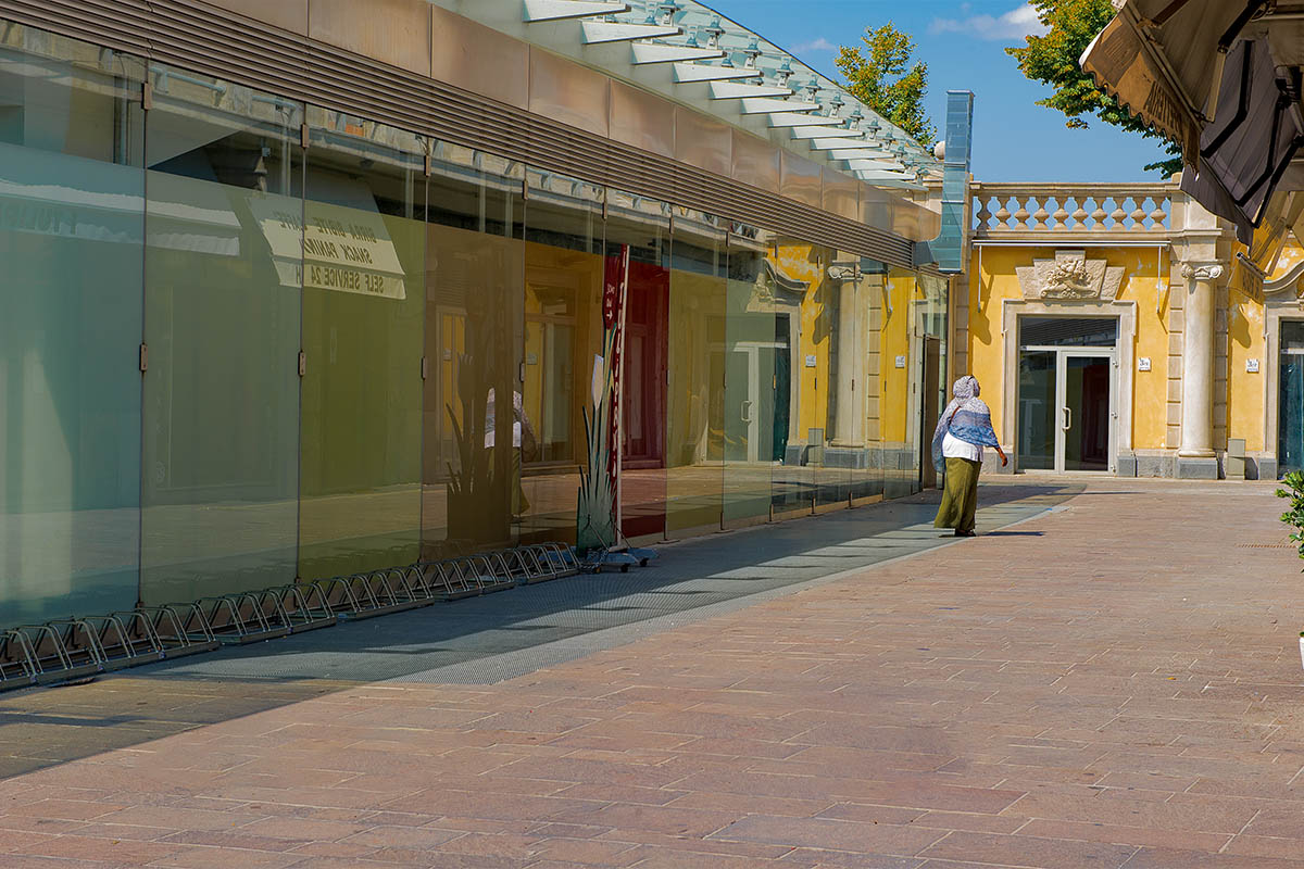
In our first category, we place images that are easy to correct, common everyday photos. These have a serious underrated educational value. We learn to read an image, consistently, we develop discipline in our workflow. Not many images need to be radically changed, and we need to discipline ourselves in serving a purpose, not pleasing our ego (well, not always!).
DifficoultComplex
Counterpart to the easier images, the most challenging ones teach us a different lesson. If simple tools and a basic workflow was enough before, now we need a more advanced strategy. We need to carefully read the image, foresee what to do with it, and therefore choose the best tools. We also need to understand when to stop, to avoid over-processing. Difficult photos extend our tools and skills palettes, and develop our creativity in finding solutions to a issue.
NormalDaily
Difficulty is a key metric, but we need to do more, a qualitative distinction is required. What appears in an image, and how. Before listing photography niches we deal with below, we can add two more important categories. The first contains everyday, personal, pictures. We’ll find amateur, natural light, and even some professional photos, like photojournalist projects, here.
ProfessionalExclusive
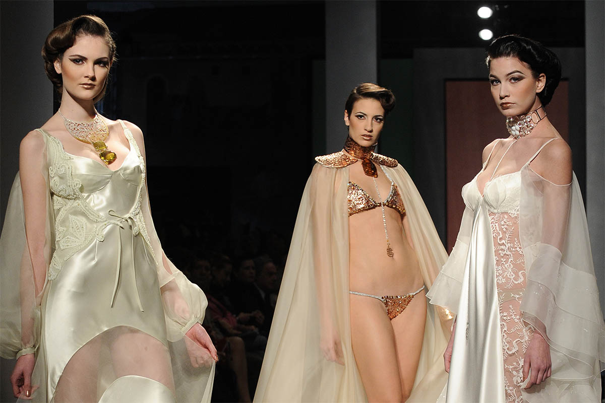
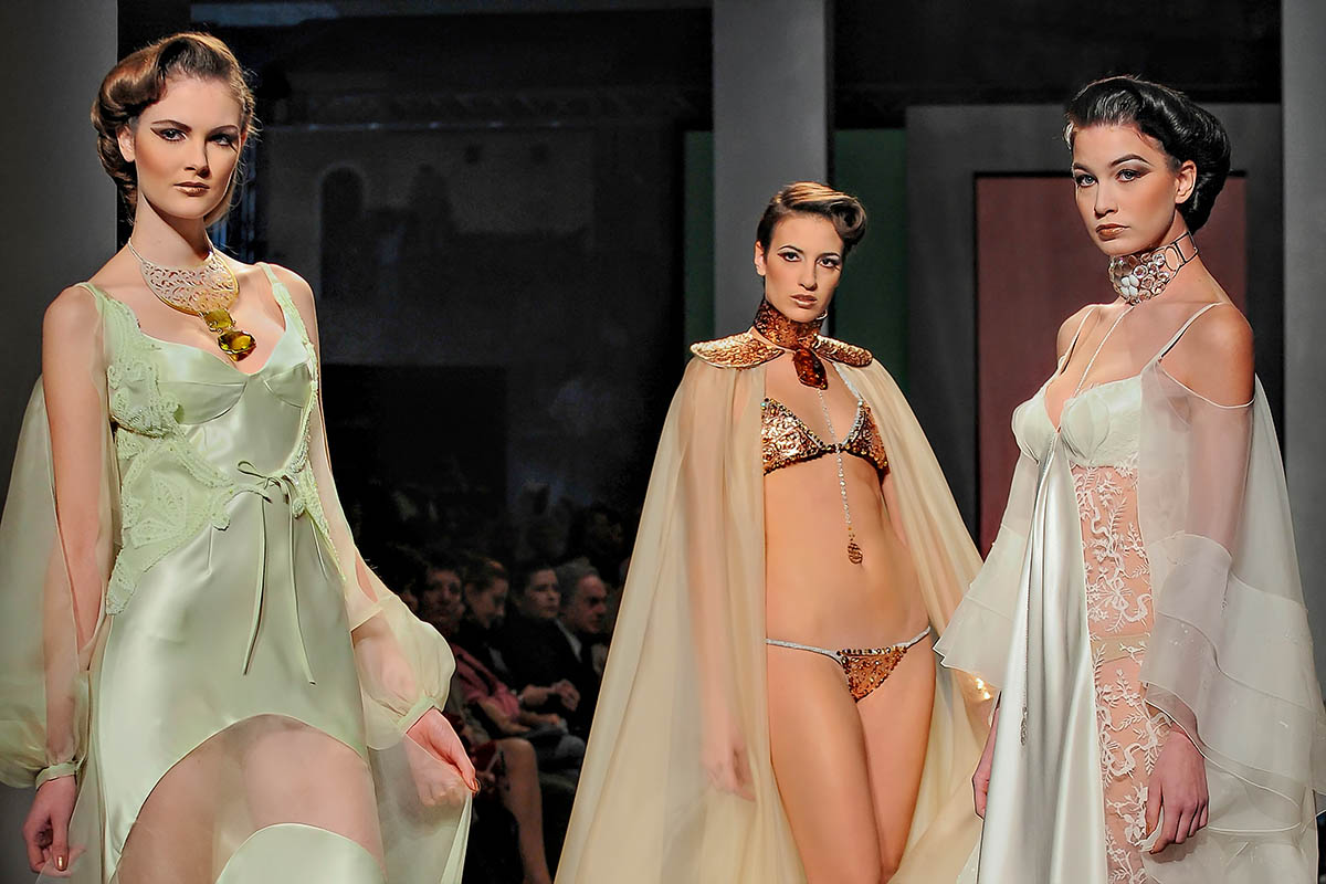
Where I really think my Workshop will engage users and colorist is dealing with professional images. Our last category is carefully hand-picked and edited. Here you will find photos created for the professional market, areas where only high quality results will be allowed. Especially in fields where additional steps are needed, like fashion, food and portraits.
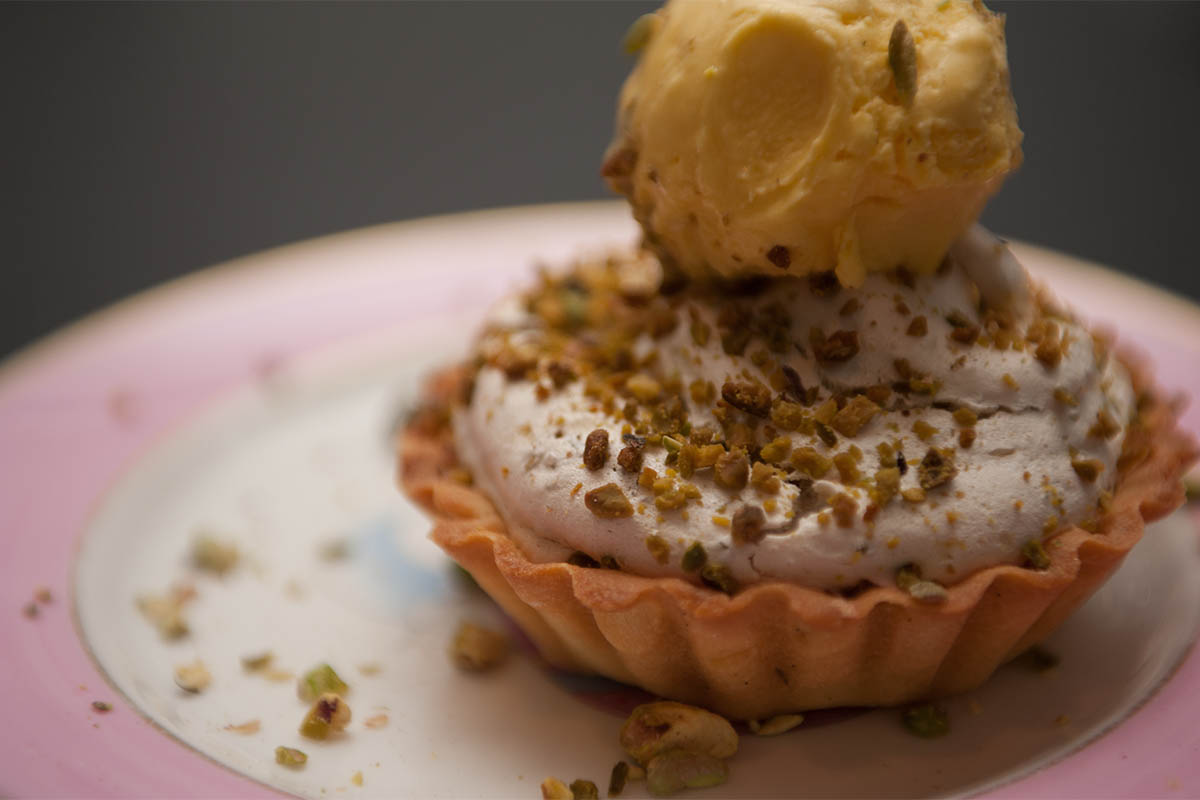
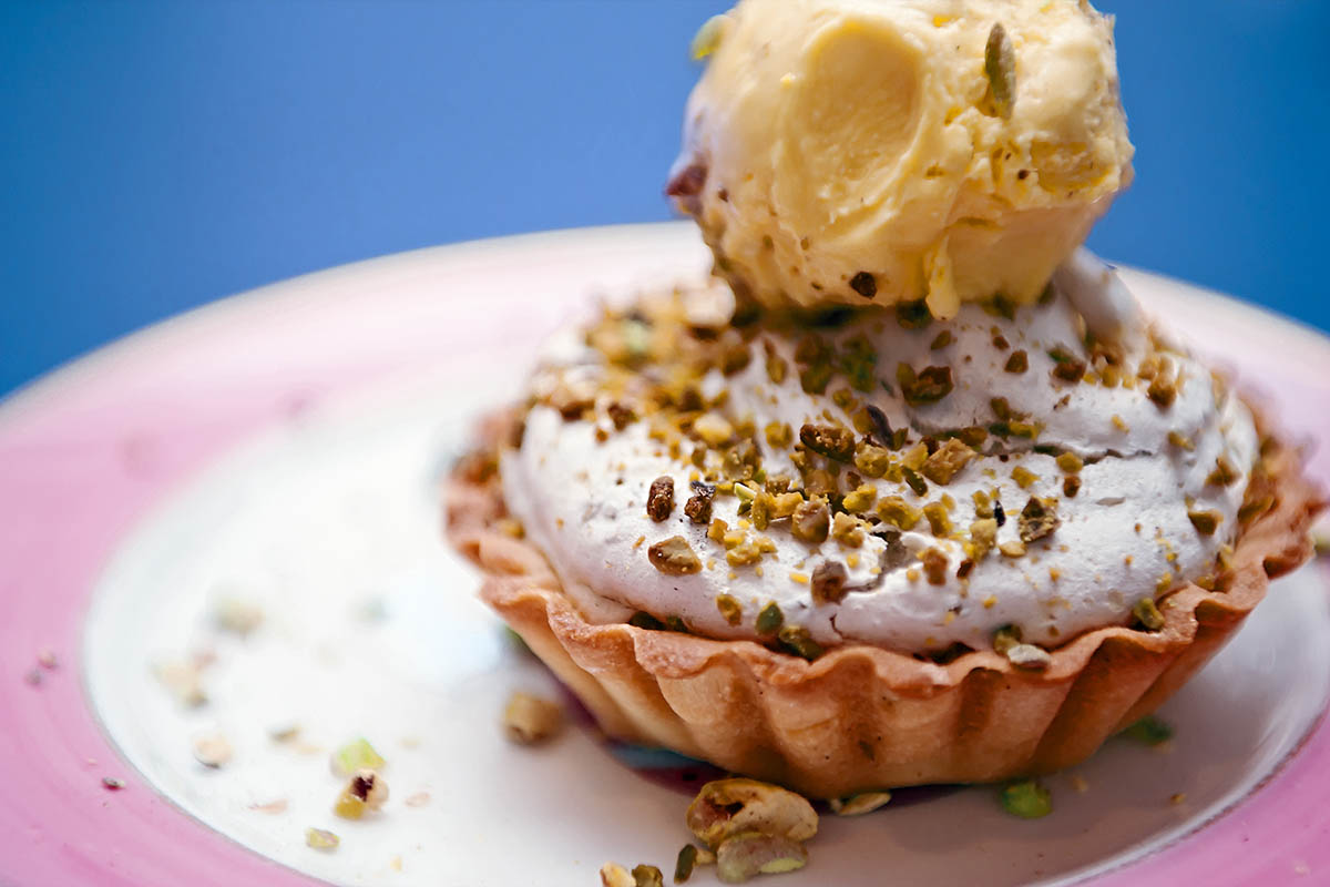
It could very well be my favourite, it combines food and an extremely high educational value. Great variety, images shot in kitchens, and thus with bad artificial lightning, flash (multiple color casts) metallic surfaces and the white of clothes. But also plated food macro photographies, sometimes with studio lights, where sharpening, contrast, colors and hues will be so much important.
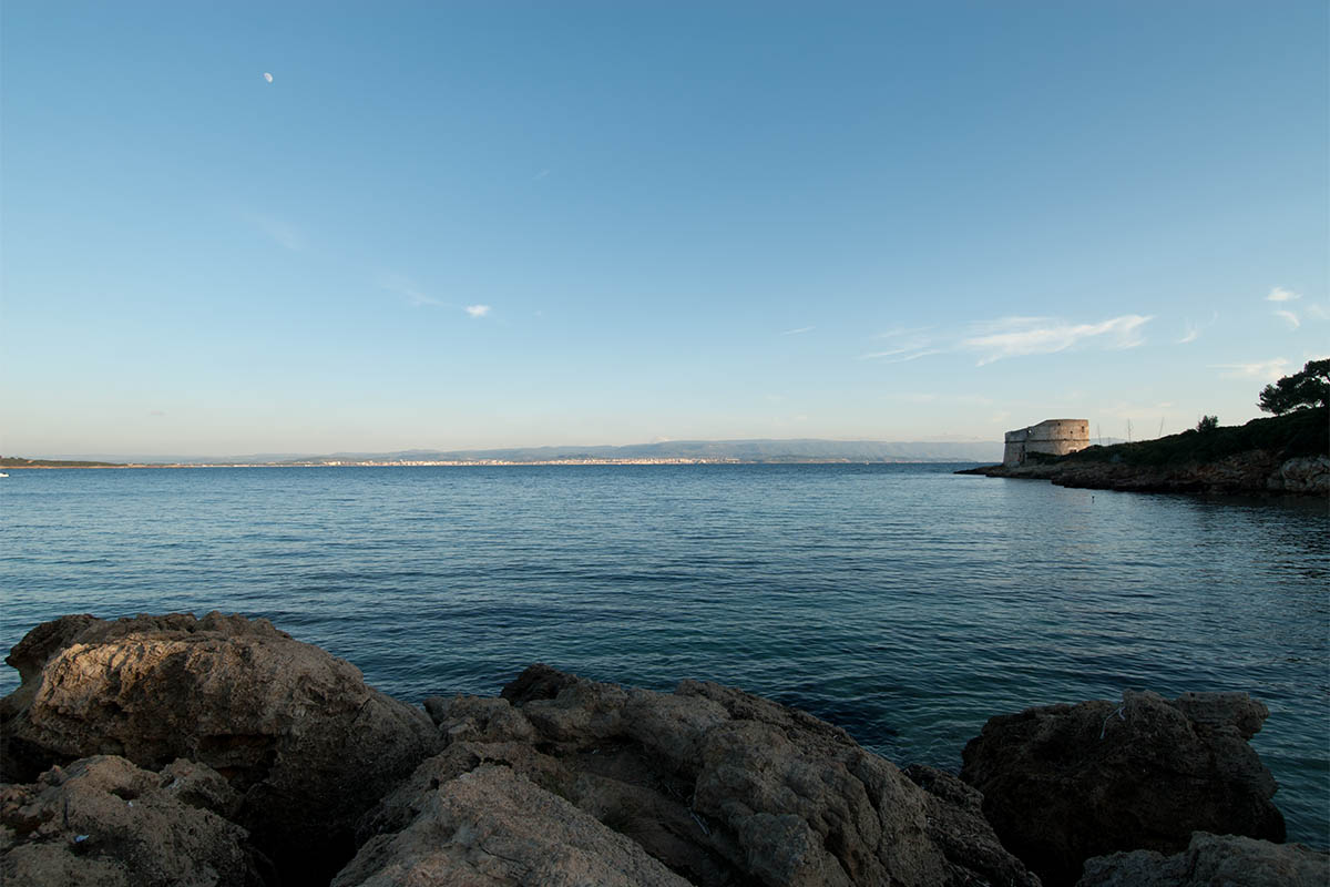
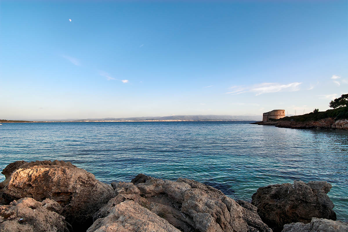
Everything nature can offer, all shades of lightning, colors and details, including color correction of nocturnal photography, and starry nights. From the never ending greeneries, to blue skies and water. These images repeatedly teach us the fundamentals, how to deal with contrast, with exposure, colors and sharpening.
Skin-tone is the most delicate color to correct and improve. So many shades in such a little interval, especially for this very reason to compare your corrected version with other colorists will be very valuable. Sharpening and creativity will play major roles in this images as well.
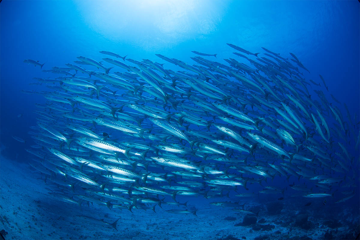
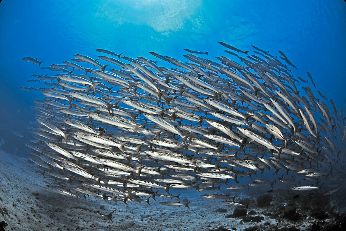
Where portraits offers a great diversity in a small range of hues, underwater photography will let us work on extreme changes on a single shade of blue. These are the most extreme color casts I ever saw, and are usually paired with impossible lightning conditions.
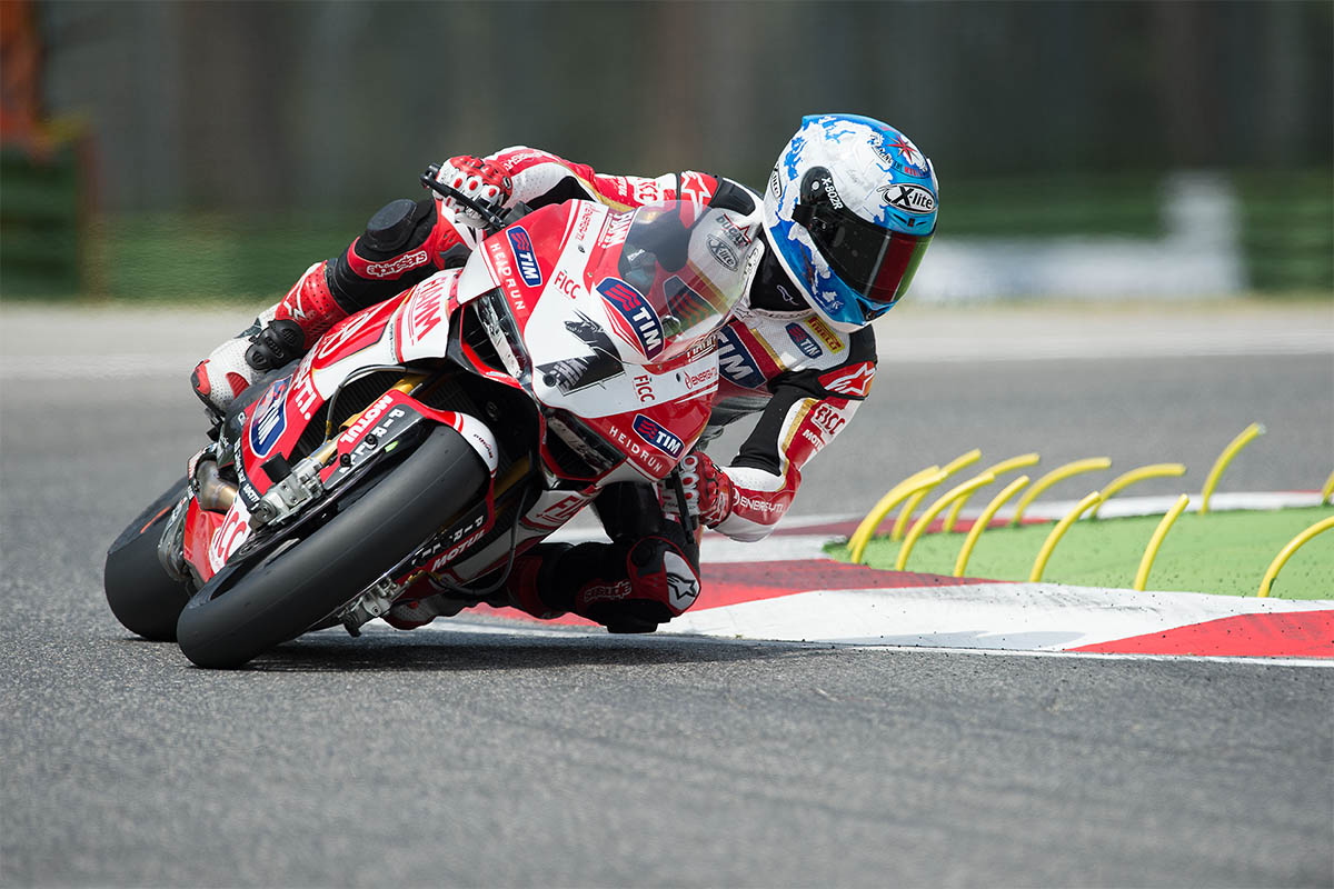
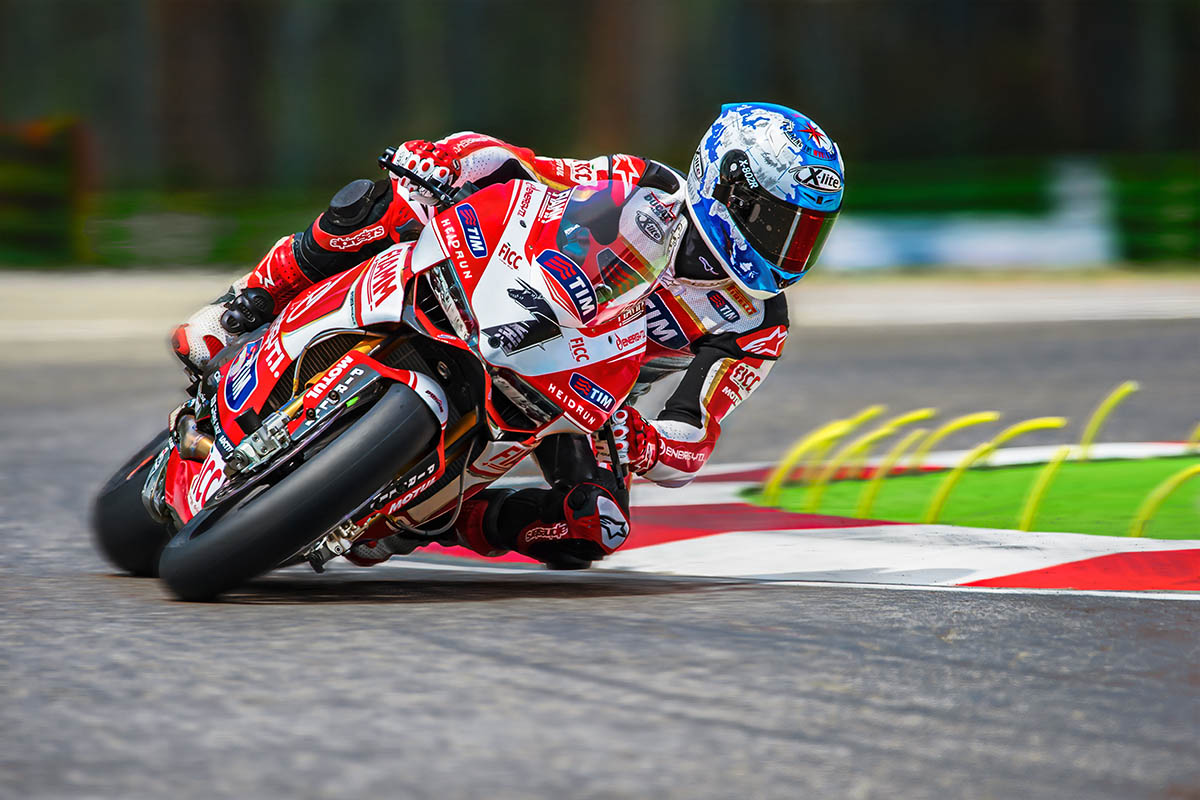
Another case where photographic conditions are usually critical, fast paced motorbikes or cars, athletes and very saturated colors. Retouching sports photos teach us to produce compelling results that needs to belong in a commercial market. We deal with metallic surfaces, noise, and colors that usually belongs to brands.
Composition is critical in this field, but is photographer’s responsibility. But everything else is on the colorist, a crucial white balancing, bright luminosity, and smart decisions on colors will make or break the color correction of architectural images. I’m considering at the moment to add renders and compositions to this category.
A modern and advance method to read an original, and analyse an image, based on Lightroom (or other RAW processor). In Photoshop we can measure colors, but in Lr we can continuously change all the parameters to see how the image react to these changes. This way we can rapidly collect info not only on the image’s issue, but on its potential as well. We can couple this with the tool “Snapshot”, to create further references to compare.
The biggest problem for users that approach post-production and color correction is not about techniques, or tools, is about image analysis. Readings is a feature of the Online Workshop, is a video where I comprehensively analyse an original un-retouched image, its flaws and potential and how to approach its enhancement.
An absolute genius, and a great friend. Davide has a large and meaningful experience in many high end professional niches. He’s a brilliant coder, and build several Photoshop extensions. He wrote, as well, several books to learn to extend Photoshop. To add insult to injury is an incredibly talented colorist as well.
A “version” is an image that has been corrected by a colorist. In our Workshop a version is produced by every colorist, every week. It has a great value, but it gets multiplied when used in combination with other versions. Even if your working solo, producing more versions of the same original, can help you producing a better result.
An “original” is an unretouched image. Usually in RAW format, it can also be in JPGs as some professionals working in the field have severe time, hardware limitations.
A general understanding of how our visual system works is important for any colorist. The visual system is not limited to our eyes, the brain plays an important role. This combination, and the results they produce, was tweaked during our evolution to serve a purpose. Some of its phenomena can be proficiently used in color correction to our advantage.
The Workshop‘s users are a legitimate Team. In years of practice, work and discoveries we distilled a common language and refined our skills. We inspired each other with smart ideas and unconventional approaches. But most of all we disagreed. Agree with each other is a good thing, but disagreement is even better. The Team corrected hundreds of images for years, and it is always invited to share feedbacks and thoughts.
A core quality, like contrast and brightness, for every colorist. As such, one of the key parameters to evaluate in a corrected version. When we talk about saturation we mean a certain hue‘s intensity. When saturation get higher colors are more vivid, when it approaches zero hues turn to grey. Often words like “vivid” or “strong” are overlooked in color science, but are still valuable to us. Especially when we remember ourselves how much important perception is in our field.
The most important technology that we got when digital imaging switched to digital. Developing a RAW file means first and foremost that we’re not actually modifying that file in any way. We are working on a different text file, or database. This is also why RAWs are called “digital negatives”, because they will stay there untouched. It is the closest stage we can get to raw data from the sensor. There are also downsides, for example each manufacturer chose a different way, and extension, and there are significant variations in different softwares.
A new tool introduced in Camera RAW and Lightroom that allows user to subtract on a layer-based logic. It acts only on local adjustments subtracting the unwanted areas of brushing and filters. It has a great importance in lessening Photoshop usage, and it is the first step towards the end of the Lightroom Photoshop dualism.
An application published by Adobe in 1990 for Mac that allowed primitive (but jaw-dropping back then). Pleasure and pain of any digital photographer, colorist, pre-press manager and hundreds of other professions, from architecture to web design. Once sold as a stand-alone application, or bundled in the Creative Suite, it is today available only via a monthly or yearly subscription. It has always been the most pirated app in the world, and one that was developed without care or vision. So many, and diverse, tools were added during the decades, that an organic and comprehensive study is now impossible.
A RAW developing application published by Adobe since 2007. Lightroom was developed around the photographers but it still requires Photoshop for a complete color correction workflow. It is divided in modules, and can be used to manage catalogues, archives, metadata, editing, post-production and exports. Since the switch to the subscription model Lightroom is part of Creative Cloud.
Our collecting, analyzing and tweaking data received from our senses. We are not capable to make absolute measures, but we are very good at comparing things. visual system and color perception are good topic for colorists to learn to add a layer of complexity to their work.
MVP, or “Most Valuable Player” is a term I took from the N.B.A. (huge fan) that is assigned to the best player on the field. In this Workshop the MVP is the Panel’s member with the most winnings.
A word that represent different things in the color correction world. A quality, a parameter, a channel in Lab, one of the two fundamental elements of a photo (the other is chroma). It is a core concept during the evaluation of a correction. It is a much more appropriate term when describing what was the exposure in a previous stage.
Let’s start from the start! Alessandro Bernardi, or AB (all acronyms in this page are friends, classmates and colleagues). A professional colorist, with a huge experience, he studied oversea with Dan Margulis, and from 2009 managed his classes in Italy. I, and many others, owe him a great debt of gratitude. The education, experience, and networking those classes generated changed many lives, mine included.
My opinion is that it is better to split color correction results in two categories: “corrections” and “interpretations”. Interpretations have a much more complex goal than corrections. They focus more on aesthetics, on subjectivity, their goal is to make a picture (or one of its element) to looks “better”. This can’t be absolute, and we risk, sometimes, to achieve the opposite result. Post-production for fashion photography, portraits and product photography usually are interpretations.
Let’s keep this simple. Hue define the kind of color we’re seeing, not how much is bright or saturated. So a saturated red, and a pale red will have the same hue, and different saturations. While a crimson red, a cardinal and a carmine will have similar hues, and different luminosities. Finally, greens and reds will have different hues. In digital color Hue can be a parameter in a color space, combined with Saturation and Lightness.
Duels is the last tool I developed. It allows you to challenge the Winner of a previous assignemt from a pool of over 300 images. You can comper your own version with the Winner’s, with the Average, and the Original. When you want, how many times you want.
My opinion is that it is better to split color correction results in two categories: “corrections” and “interpretation“. Corrections focus on objectively improving an original. Removing issues like color casts or lack of contrast, and improving saturation. It should be the first step in any job, and it should be the goal of photojournalism or scientific images. This required precision can, sometimes, make things harder, like in multi-images projects.
A core quality for colorists. As with many concepts in disciplines that involve perception it is much easier to observe the changes than to give a definition. If we increase contrast highlights will be brighter and shadows darker, if we reduce it the opposite will happens. Its definition, the relationship with dynamic range and the analogies with other disciplines require much more time and space.
The most important feedback we can have happens when we compare two version of the same image. We’re not able to measure colors with our eyes, but our visual system can compare things very quickly, and we can gain great value in this comparison. What works better, if there is a color casts, paired with tools to read color values we can safely tell the quality of our work.
Professionals in the fields of color correction. It is a quite definite subset of pros, like retoucher, or post-producers. Once (film age) a very prestigious career, with the transition to digital its value was diluted and quickly forgotten. Learning color correction is frequently mistaken with studying Photoshop, or other image processing applications. That couldn’t be more wrong.
Color, limiting this definition in regards of our professions and studies, is our perception of the macroscopic manifestation of physical properties in everything around us. Our visual system is based on perception, and evolved for hundreds of millennia with a purpose: surviving. Studying this phenomena can be rewarding, like in the case of chromatic operation, or adaptation.
Once the the line that divided pros from amateurs this still relevant color method is used less and less day by day. The importance of having four more channels will always be the same, but the more modern RAW tools (and the huge amount of time required to learn Photoshop ‘till CMYK), and the better quality we get from digital cameras, allows for much simpler and faster tools.
One of the fundamental elements that compile a digital image. Channels are usually three (RGB, Lab) or four (CMYK), and they are very valuable in practical color correction as well. They are essentially black and white versions of an image (where black and white values depends on colors), thus are great for masking, or reading an image.
Different sets of calculations that allows for different interactions of two adjacent layers. We can set the blend mode of a layer, adjustment layer or smart object, the result will impact luminosity, color or both. There are as well some primitive logic functions, like “difference”.
Our visual system and our color perception will always be more advanced than a camera. Sure, there will be hardware capable of features we can compete with (it is already like this with night vision), but these usually involve peculiar hardwares and algorithms that do not produce good, nor natural, images. The power our brain has to manipulate colors will probably never be matched by a sensor. This is why many times there is no match in what we see, and what our camera sees, forcing us to operate a balance.
Photography’s original language (although imposed by technical limitations). Still doable, but massively penalized by digital, black and white is actually a very difficult language to recreate. Similarly to the imitation of gold on paper, todays colorists fail to understand a good old-fashion black and white print used many technologies not available anymore. A huge market, not always honest, gravitates around B&W, from grains to apply, to filter to auto-generate corrections. The best approach is still understanding how a color image is created, and to use its channels.
My favourite Photoshop tool is also a long forgotten one. I will write a complete article soon, in the meantime let me say blend-if is the most powerful tool to blend two different layers, allowing logical operations, especially when used in Lab. It is as well a tool that can be used in combination with masks, blend modes and opacity. What used to make Photoshop truly essential, at least until Range Mask came out in Camera RAW, and Lightroom.