A quite interesting concept that may introduce colorist to learn the visual system and appearance phenomena. Very useful for retouchers and photographers, simultaneous contrast, is a topic missing in the vast majority of learning experiences, workshops and classes, in digital photography, color correction and Photoshop.
Key Facts:
Simultaneous contrast is a visual perception phenomenon.
The visual system is composed by mechanical, optical, chemical and electrical subsets.
The evolution of the visual system didn’t focus on precision, but rather on usefulness.
For survival it is much more important to distinguish (or separate) a lion in the middle of savannah, than it is to be able to appreciate two identical yellows.
This behaviour, though, introduce a relativism in our color perception.
This relativism can, often, be used to improve our images in photographic post-production.
Should a colorist even learn about the visual system?
Learning color correction, I will never stop saying this, should be a practical experience. For the luckiest, we could say practical as well.
Some topics sure are necessary, for example what is the best approach for a successful backup for a photographer. Some theories, like the zonal system, are interesting, from an historic point of view as well. But the visual system, and the visual perception, should probably be learned first. I’m using “probably”, because in these years I saw users often unable to contain the enthusiasm, with the risk of overdoing what should be a subtle interpretation.
I researched many visual perception phenomena (crispening, spreading, Bezold-Brücke, Abney, Helmholtz–Kohlrausch, color constance, Hunt, Stevens, Helson-Judd, Bartleson-Breneman and others), and even if all of them are interesting on paper, just few are actually usable in color correction. Simultaneous contrast is interesting and it is useful as well. I will write about all of these as well at a later time.
Challanges in learning about visual perception
Charles Darwin wasn’t able to reconcile the evolution of the eye given its complexities and diversity of eye designs.
So it was a major surprise for us that we have found what appears to be a clear progression from a simple eye to a complex eye, which occurred over a relatively short period (30 million years) in evolutionary history.
Professor Shaun Collin, from UQ’s School of Biomedical Sciences
When we study the visual system, we do not learn just about the eyes, but a complex combination of eyes and brain (and even this is blatantly oversimplify). Our eyes gather data and send the information to the brain where they are interpreted, and manipulated with a purpose that is driven and refined by our species evolution.
We can quantify simultaneous contrast only through comparison
In our everyday color perception the cognitive processes are extremely important. We should repeat now that we are talking about visual perception and not how we measure color, because we are absolutely unable to.
New evidence suggests that the human visual system incorporates a high-level, functionally specialised system for monitoring animals. Such a mechanism may have evolved to direct attention differentially to ancestrally important categories of objects, regardless of their current relevance.
Geraint Rees – Vision: The Evolution of Change Detection
The simultaneous contrast
The fact that the after-image or simultaneous contrast is a psycho-physiological phenomenon should prove that no normal eye, not even the most trained one, is foolproof against color deception. He who claims to see color independent of their illusionary changes fools only himself, and no one else.
Interaction of Color, Josef Albers 1963
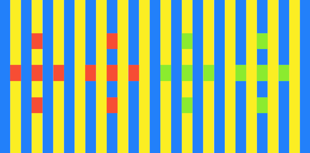
Simultaneous contrast is a phenomenon that happens when two adjacent colors influence each other, changing our perception of these colors (more or less saturated, more or less bright). It can be observed both with different hues, or luminosities.
All reds are the same red, and all the greens are the same green, their perception changes depending what colors are adjacent
Also, and this is a very important point, this is a phenomenon that can be evaluated only with comparison.
Something that is true for all perception phenomena. We are not able to say, or define, how much an item may be cold or how much a color may be saturated. We can only say that something is colder than something else, or more saturated than.
And this is where an excess of relativism can be dangerous. Let’s say we show an image that we color corrected to someone that does not work with color or photography.
This observer, doesn’t like the photo and tells us that the subject, a car, is oversaturated. How should we react to this feedback?
The most prominent among the phenomena of interaction is, of course, color contrast. The principle received its classical formulation by Michel Eugene Chevreul, the French chemist and director of the Gobelin tapestry works. He described simultaneous contrast as follows: ”If one views at the same time two areas of different brightness but of the same hue, or of the same brightness but of different hue, in juxtaposition, i.e., bordering on each other, the eye will observe (provided the areas are not too large) modifications that bear in the first case on the intensity of the color and in the second on the optical composition of the two juxtaposed colors.”
Since the effect of color contrast operates in the direction of physiological complementarity, it serves to heighten it where it already exists, e.g., in the relation between blue and yellow, or to modify colors in the direction of such complementarity if they are reasonably close to it. Von Allesch experimented with a greenish yellow and a reddish yellow whose admixtures were so slight that when inspected separately both colors looked like pure yellows. Brought together they tended to emphasize their distinctness, looking dearly greenish and reddish and presumably producing the kind of clash already discussed as the effect of "Similarity of the Dominant." But if a third yellow of intermediate hue was placed between the two, the contrast diminished and the total arrangement showed a more unified yellow. Such effects of assimilation are also observed when, for example, one strongly red patch in a painting brings out subtly red components in the colors around it.
Art and visual perception, Rudolf Arnheim, 1954
Back to the feedback that our observer gave us. First it is an opinion, and it has a value. We will start from who gave the opinion to us, someone that is not a professional. To this person, though, we didn't ask a feedback on sharpening or local contrast, both elements that requires an education in color.
That opinion is simple, and on a very common object, a car, that everyone see on daily basis. Let’s not hide behind the usual “I wanted this image exactly like this”, or “I understand, but there is a simultaneous contrast effect that you do not know about”. A good correction shouldn’t be explained.
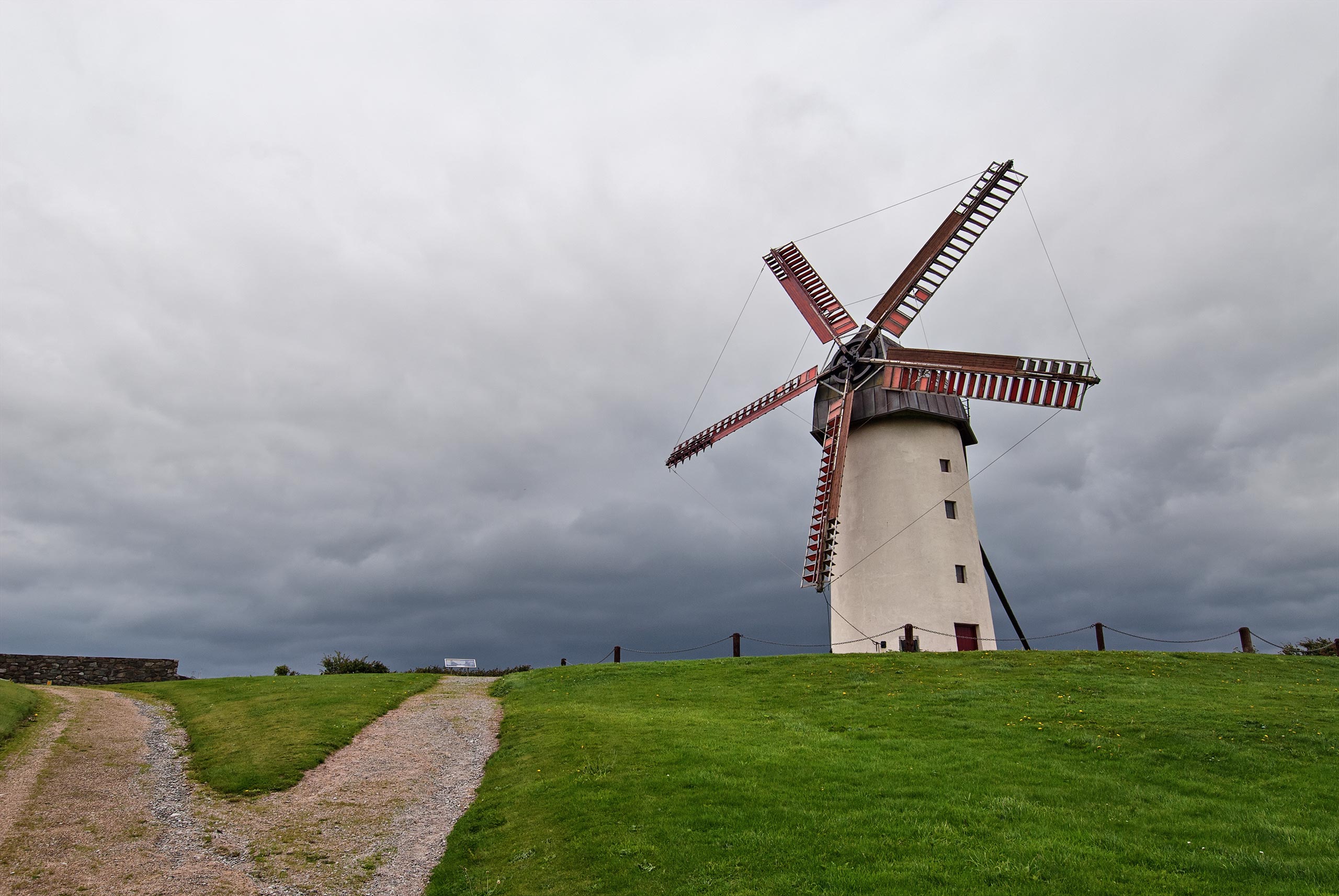
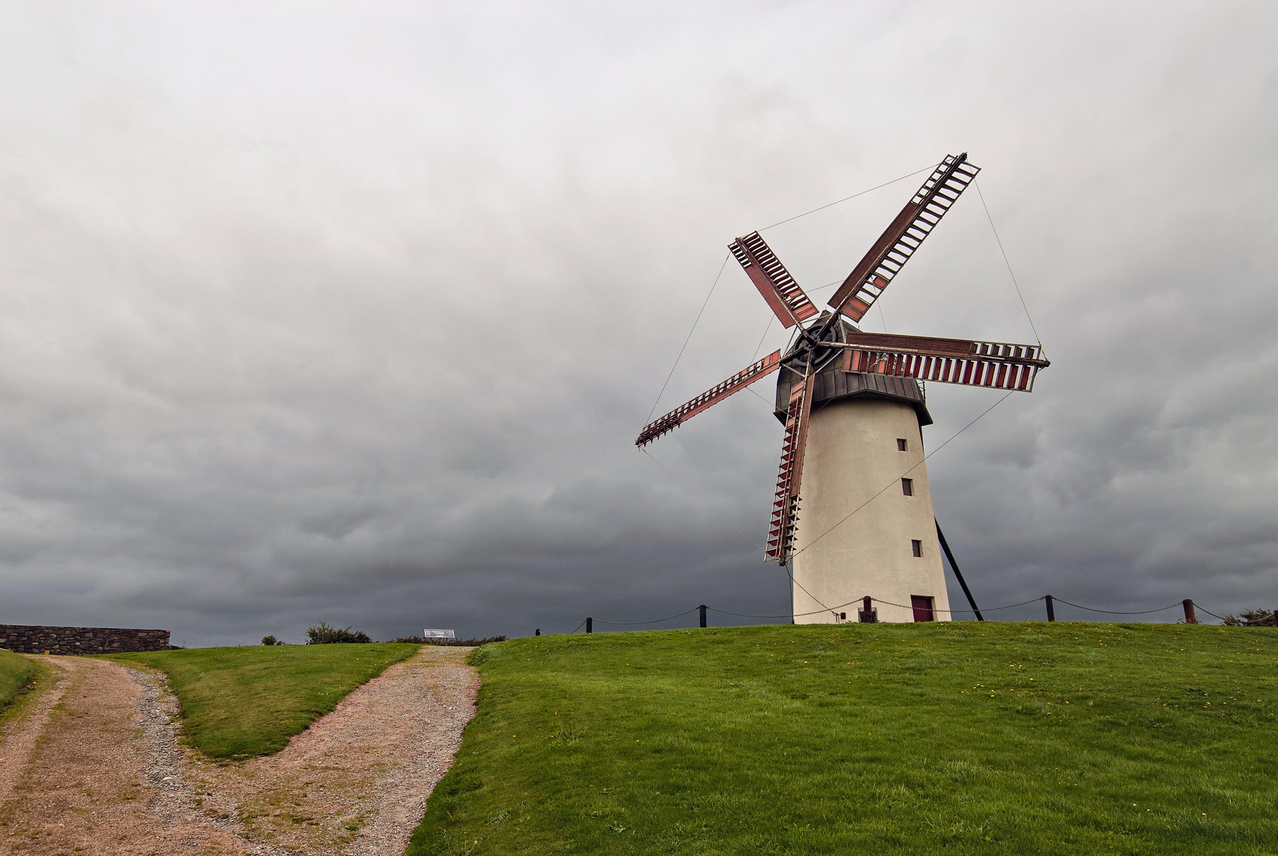
On the left the average version, with slightly cooler colors, and a more prominent simultaneous contrast. On the right Doug’s version with neutral clouds.
To a colorist, every opinion, each feedback, is precious. We need to learn to listen, to be able to verify, to make choices and to achieve results. To listen often means to translate feedbacks from an obscure language (this image is too loud, or I think it should be more crunchy), to verify with the tools we know, and to apply corrections if needed.
And this is even more important if we are dealing with a photographer.
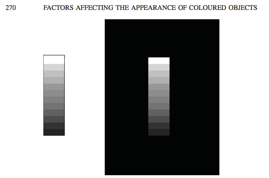
The appearance of a colour can be greatly affected by the presence of other colours around it; this is termed simultaneous contrast (or chromatic induction). Simultaneous contrast can result in large changes in the appearance of colours in items such as woven fabrics and tapestries. The French chemist Michel Eugene Chevreul, as director of Gobelin, the famous carpet manufacturer, was one of the first to investigate the phenomenon; in 1839 he introduced his law: “two adjacent colours, when seen by the eye, will appear as dissimilar as possible”.Chevreul, 1839.
In Figure 14.3 the effect of simultaneous contrast on lightness is demonstrated. It is well known that a dark surround makes a colour look lighter, and a light surround makes it look darker. But it is also true that a dark surround lowers apparent contrast, and this is evident in the right-hand part of the figure. This contrast-lowering effect occurs quite strongly when pictures are projected in cinemas, and has to be countered by increasing the contrast of the picture being projected.
Hunt – Measuring Color
A practical example
To sum it up, simultaneous contrast is a visual perception phenomenon. The term already suggest a relativism. Our body, including the visual system, evolved to perceive the differences, especially when these became very subtle. The best way to achieve this was to introduce, in ourselves, a subjectivity. But let’s try also to not be limited by this, let’s give a clear foolproof example. We can see boxes of squares and colors in many places of the web, but I will use something from Josef Albers’ book that is even better.
The author asks his student to take three buckets of water. The first one contains cold water, the third one hot water. The middle one contains half of cold and half of hot water. He then asks to a student to place one hand in the cold water, and one hand in the hot. It is a clear to the student what is being perceived, one hand is feeling cold, one hot.
At this point the student is asked to remove both hands, and put them in the middle bucket. And here we can understand easily the whole issue. The hand that was before in the cold water is now feeling warmer, but at the same time the hand that was in the hot water is perceiving cold.
This simultaneous perception of different quantities from the same entity shines as an example of how our body works. Hot, cold, are only words that we use to express something that we cannot measure, but that at the same time has a deep meaning for us.
A modern and advance method to read an original, and analyse an image, based on Lightroom (or other RAW processor). In Photoshop we can measure colors, but in Lr we can continuously change all the parameters to see how the image react to these changes. This way we can rapidly collect info not only on the image’s issue, but on its potential as well. We can couple this with the tool “Snapshot”, to create further references to compare.
The biggest problem for users that approach post-production and color correction is not about techniques, or tools, is about image analysis. Readings is a feature of the Online Workshop, is a video where I comprehensively analyse an original un-retouched image, its flaws and potential and how to approach its enhancement.
An absolute genius, and a great friend. Davide has a large and meaningful experience in many high end professional niches. He’s a brilliant coder, and build several Photoshop extensions. He wrote, as well, several books to learn to extend Photoshop. To add insult to injury is an incredibly talented colorist as well.
A “version” is an image that has been corrected by a colorist. In our Workshop a version is produced by every colorist, every week. It has a great value, but it gets multiplied when used in combination with other versions. Even if your working solo, producing more versions of the same original, can help you producing a better result.
An “original” is an unretouched image. Usually in RAW format, it can also be in JPGs as some professionals working in the field have severe time, hardware limitations.
A general understanding of how our visual system works is important for any colorist. The visual system is not limited to our eyes, the brain plays an important role. This combination, and the results they produce, was tweaked during our evolution to serve a purpose. Some of its phenomena can be proficiently used in color correction to our advantage.
The Workshop‘s users are a legitimate Team. In years of practice, work and discoveries we distilled a common language and refined our skills. We inspired each other with smart ideas and unconventional approaches. But most of all we disagreed. Agree with each other is a good thing, but disagreement is even better. The Team corrected hundreds of images for years, and it is always invited to share feedbacks and thoughts.
A core quality, like contrast and brightness, for every colorist. As such, one of the key parameters to evaluate in a corrected version. When we talk about saturation we mean a certain hue‘s intensity. When saturation get higher colors are more vivid, when it approaches zero hues turn to grey. Often words like “vivid” or “strong” are overlooked in color science, but are still valuable to us. Especially when we remember ourselves how much important perception is in our field.
The most important technology that we got when digital imaging switched to digital. Developing a RAW file means first and foremost that we’re not actually modifying that file in any way. We are working on a different text file, or database. This is also why RAWs are called “digital negatives”, because they will stay there untouched. It is the closest stage we can get to raw data from the sensor. There are also downsides, for example each manufacturer chose a different way, and extension, and there are significant variations in different softwares.
A new tool introduced in Camera RAW and Lightroom that allows user to subtract on a layer-based logic. It acts only on local adjustments subtracting the unwanted areas of brushing and filters. It has a great importance in lessening Photoshop usage, and it is the first step towards the end of the Lightroom Photoshop dualism.
An application published by Adobe in 1990 for Mac that allowed primitive (but jaw-dropping back then). Pleasure and pain of any digital photographer, colorist, pre-press manager and hundreds of other professions, from architecture to web design. Once sold as a stand-alone application, or bundled in the Creative Suite, it is today available only via a monthly or yearly subscription. It has always been the most pirated app in the world, and one that was developed without care or vision. So many, and diverse, tools were added during the decades, that an organic and comprehensive study is now impossible.
A RAW developing application published by Adobe since 2007. Lightroom was developed around the photographers but it still requires Photoshop for a complete color correction workflow. It is divided in modules, and can be used to manage catalogues, archives, metadata, editing, post-production and exports. Since the switch to the subscription model Lightroom is part of Creative Cloud.
Our collecting, analyzing and tweaking data received from our senses. We are not capable to make absolute measures, but we are very good at comparing things. visual system and color perception are good topic for colorists to learn to add a layer of complexity to their work.
MVP, or “Most Valuable Player” is a term I took from the N.B.A. (huge fan) that is assigned to the best player on the field. In this Workshop the MVP is the Panel’s member with the most winnings.
A word that represent different things in the color correction world. A quality, a parameter, a channel in Lab, one of the two fundamental elements of a photo (the other is chroma). It is a core concept during the evaluation of a correction. It is a much more appropriate term when describing what was the exposure in a previous stage.
Let’s start from the start! Alessandro Bernardi, or AB (all acronyms in this page are friends, classmates and colleagues). A professional colorist, with a huge experience, he studied oversea with Dan Margulis, and from 2009 managed his classes in Italy. I, and many others, owe him a great debt of gratitude. The education, experience, and networking those classes generated changed many lives, mine included.
My opinion is that it is better to split color correction results in two categories: “corrections” and “interpretations”. Interpretations have a much more complex goal than corrections. They focus more on aesthetics, on subjectivity, their goal is to make a picture (or one of its element) to looks “better”. This can’t be absolute, and we risk, sometimes, to achieve the opposite result. Post-production for fashion photography, portraits and product photography usually are interpretations.
Let’s keep this simple. Hue define the kind of color we’re seeing, not how much is bright or saturated. So a saturated red, and a pale red will have the same hue, and different saturations. While a crimson red, a cardinal and a carmine will have similar hues, and different luminosities. Finally, greens and reds will have different hues. In digital color Hue can be a parameter in a color space, combined with Saturation and Lightness.
Duels is the last tool I developed. It allows you to challenge the Winner of a previous assignemt from a pool of over 300 images. You can comper your own version with the Winner’s, with the Average, and the Original. When you want, how many times you want.
My opinion is that it is better to split color correction results in two categories: “corrections” and “interpretation“. Corrections focus on objectively improving an original. Removing issues like color casts or lack of contrast, and improving saturation. It should be the first step in any job, and it should be the goal of photojournalism or scientific images. This required precision can, sometimes, make things harder, like in multi-images projects.
A core quality for colorists. As with many concepts in disciplines that involve perception it is much easier to observe the changes than to give a definition. If we increase contrast highlights will be brighter and shadows darker, if we reduce it the opposite will happens. Its definition, the relationship with dynamic range and the analogies with other disciplines require much more time and space.
The most important feedback we can have happens when we compare two version of the same image. We’re not able to measure colors with our eyes, but our visual system can compare things very quickly, and we can gain great value in this comparison. What works better, if there is a color casts, paired with tools to read color values we can safely tell the quality of our work.
Professionals in the fields of color correction. It is a quite definite subset of pros, like retoucher, or post-producers. Once (film age) a very prestigious career, with the transition to digital its value was diluted and quickly forgotten. Learning color correction is frequently mistaken with studying Photoshop, or other image processing applications. That couldn’t be more wrong.
Color, limiting this definition in regards of our professions and studies, is our perception of the macroscopic manifestation of physical properties in everything around us. Our visual system is based on perception, and evolved for hundreds of millennia with a purpose: surviving. Studying this phenomena can be rewarding, like in the case of chromatic operation, or adaptation.
Once the the line that divided pros from amateurs this still relevant color method is used less and less day by day. The importance of having four more channels will always be the same, but the more modern RAW tools (and the huge amount of time required to learn Photoshop ‘till CMYK), and the better quality we get from digital cameras, allows for much simpler and faster tools.
One of the fundamental elements that compile a digital image. Channels are usually three (RGB, Lab) or four (CMYK), and they are very valuable in practical color correction as well. They are essentially black and white versions of an image (where black and white values depends on colors), thus are great for masking, or reading an image.
Different sets of calculations that allows for different interactions of two adjacent layers. We can set the blend mode of a layer, adjustment layer or smart object, the result will impact luminosity, color or both. There are as well some primitive logic functions, like “difference”.
Our visual system and our color perception will always be more advanced than a camera. Sure, there will be hardware capable of features we can compete with (it is already like this with night vision), but these usually involve peculiar hardwares and algorithms that do not produce good, nor natural, images. The power our brain has to manipulate colors will probably never be matched by a sensor. This is why many times there is no match in what we see, and what our camera sees, forcing us to operate a balance.
Photography’s original language (although imposed by technical limitations). Still doable, but massively penalized by digital, black and white is actually a very difficult language to recreate. Similarly to the imitation of gold on paper, todays colorists fail to understand a good old-fashion black and white print used many technologies not available anymore. A huge market, not always honest, gravitates around B&W, from grains to apply, to filter to auto-generate corrections. The best approach is still understanding how a color image is created, and to use its channels.
My favourite Photoshop tool is also a long forgotten one. I will write a complete article soon, in the meantime let me say blend-if is the most powerful tool to blend two different layers, allowing logical operations, especially when used in Lab. It is as well a tool that can be used in combination with masks, blend modes and opacity. What used to make Photoshop truly essential, at least until Range Mask came out in Camera RAW, and Lightroom.