Key facts:
- A preliminary analysis of an unedited photograph is always recommended.
- It can happen, not very often, that no white balance adjustment is needed.
- Depending on the scene, it may be possible that white balance could be correct in a wider range of values (dusk, sunset).
- From an operational perspective, if we are working on an image that presents an homogeneous, non critical illuminant, then adjusting white balance is a simple step, and the easiest way to do it is in a RAW processors (like Lightroom or Capture One) with a dedicated tool.
- If, on the other hand, we are working on a photo with multiple and heterogenous illuminants with different color temperatures, or if the lighting is critical (underwater photography, low-light), adjusting white balance will be complicated and the only environment that always grants success will be a raster graphic editor (like Photoshop or Affinity Photo).
- Adjusting white balance plays a critical, and delicate role, especially when we work on a set of images that will be displayed side by side.
- It is possible, sometimes, in some images, to offset white balance towards less corrected values, to improve our perception (improving chromatic variations).
Adjusting white balance is a necessary operation. Before anything else we need to understand why. A photograph is a technical representation of a scene lit in some way. This way matters, a lot. The illuminant, that could be the sun, a lamp, our flash, has a tremendous impact on the chromatic component of our image. So important, in fact, that reflex cameras manufacturers even bothered building hardware dials (that are to be used with JPG formats) on consumers’ and prosumers’ cameras, that display different illuminants, like the ones in this list.
| Source | Color Temperature (K) |
|---|---|
| Candle | 1800 |
| 60-watt tungsten lamp | 2800 |
| 100-watt tungsten lamp | 2900 |
| 250-watt photographic lamp | 3200 |
| 250-watt studio flood lamp | 3400 |
| Flashbulb (uncoated) | 4000 |
| Direct sunlight | 4500 |
| Photographic daylight | 5500 |
| Electronic flash | 6000 |
| LSky light (overcast sky) | 8000 |
| North sky light | 15000 |
From: “Basic Photographic Materials and Processes” by Leslie Stroebel John Compton Ira Current Richard Zakia
Now we can be sure, and say it firmly, that the colors we see in a photograph are relative, and that they do not depend (only) on the sensor, the lens, the exposure, but especially on the quality of the light that lit our scene.
The biggest issue, though, is that most of the times we are not able to perceive these shifts in color temperatures while we are witnessing the scene. This happens because our visual system is quite skilled in compensating the illuminants we are facing. The difference between what we perceive and what we capture create quite the hardship for new users and amateurs. It is quite easy to spot an underexposed image, or a blurred one, but I witnessed countless fails in identify even severe color casts.
We should also state that is quite comprehensible that a photographer may be more careful about the exposure, that may be perceived as a direct responsibility. But since the RAW format started spreading, white balance settings was no more required in camera, and was delegated to post-production, and this still creates in many the illusion that a digital negative shouldn’t be color corrected, because it already sports its “true colors”.
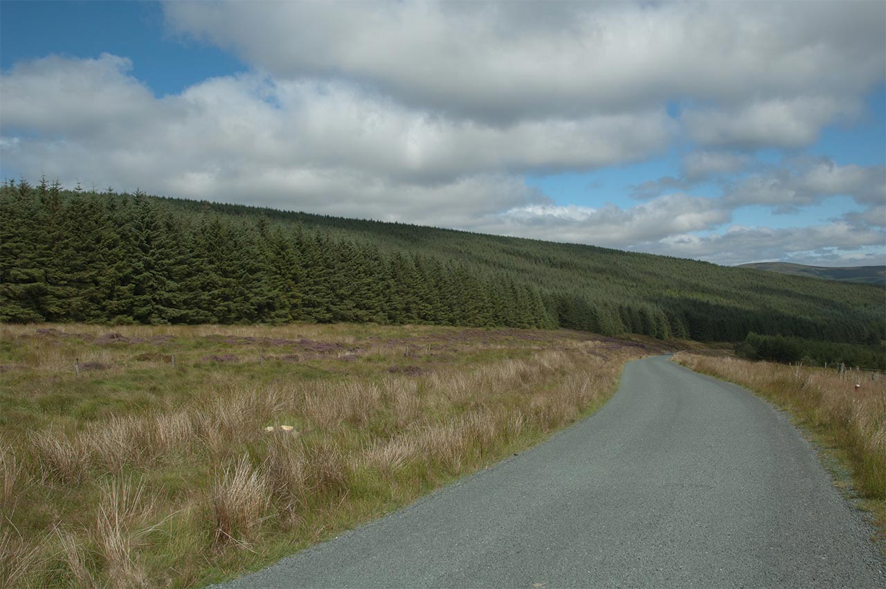
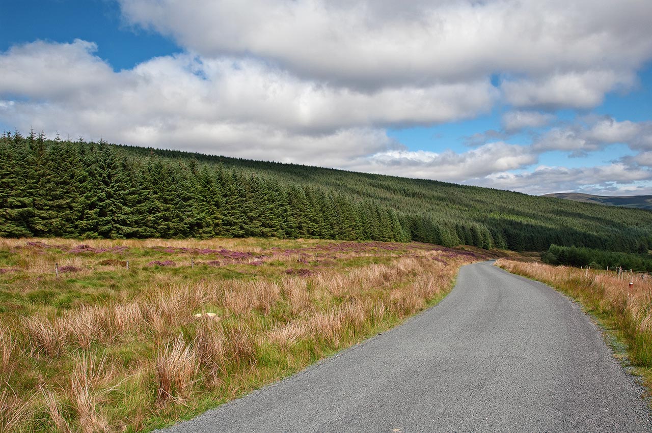
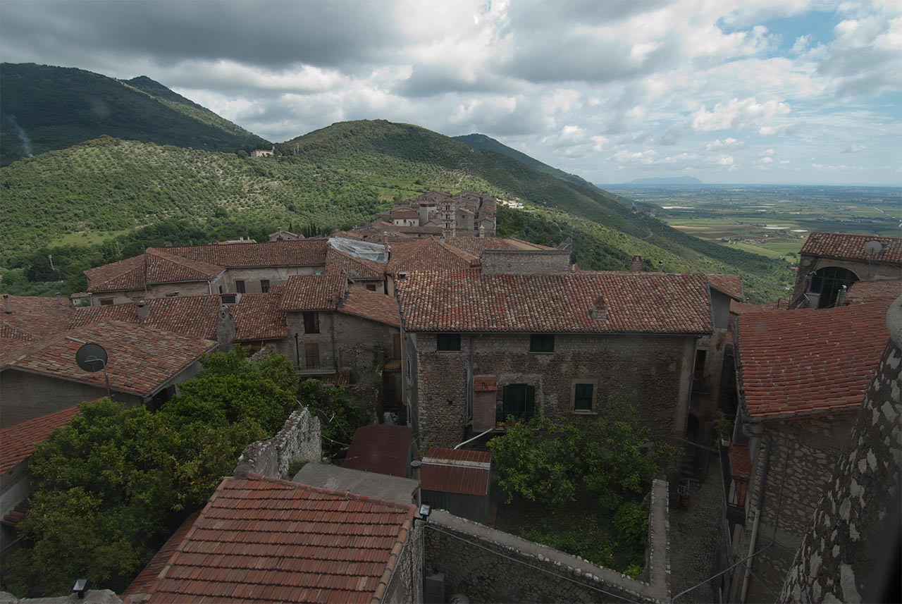
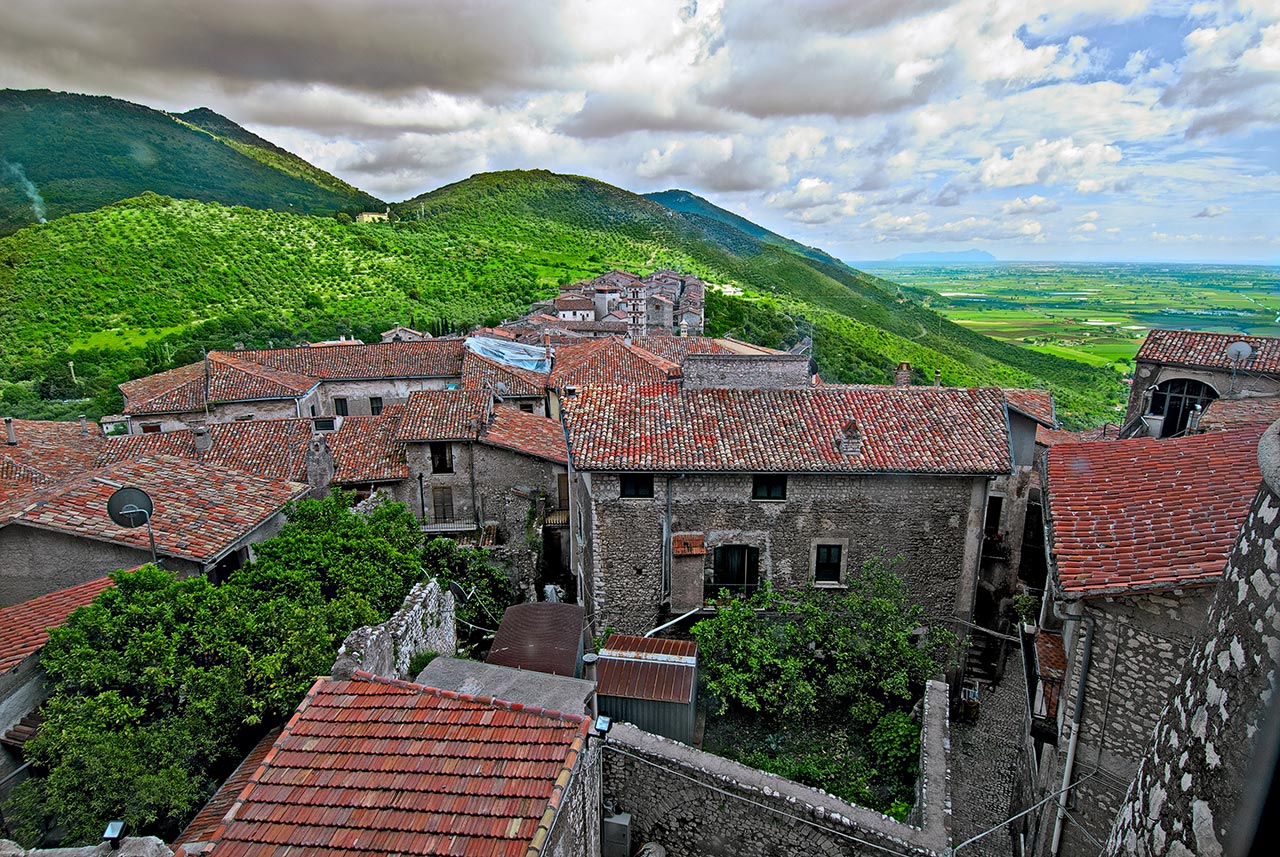
A photograph that needs a simple white balance adjustment. A preliminary analysis shows that the road is slightly green. We can’t be sure that, in this particular county in Ireland, asphalt is indeed green, but we can measure the same imbalance in clouds as well. We can, now, be sure that there is a color cast, and that green needs to be removed. On the right the average, made with versions from the Workshop’s colorists.
White balance itself is a misleading term as well. It isn’t the only term we ever used, at some point before, or after, the digital transition grey balance, light balance, chromatic balance, were common. Curiously Lightroom itself warns us if we try to use the white balance tool on a white, it asks us to choose a darker neutral point. Correctly of course, if we would be able to do that we could choose a point where one of the channels (or their representation) could be clipped, resulting in a wrong white balance.
White Balance Analysis
In my career I worked on several images that didn’t required a white balance adjustment. But, every single time, I knew that after I measured the colors’ numbers, I never skipped that step because “I liked the image that way”. We should evaluate the chromaticity of an image for as long as our deadlines allow.
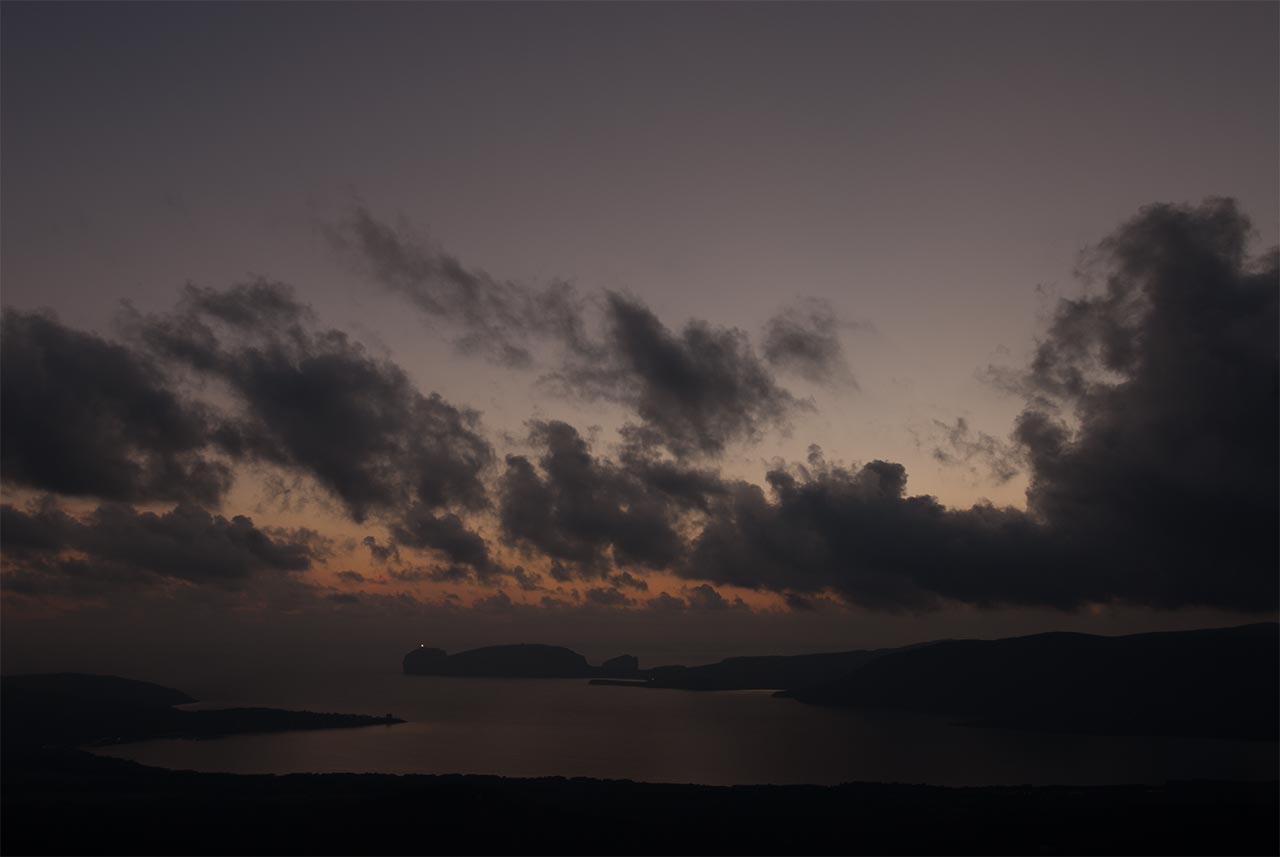
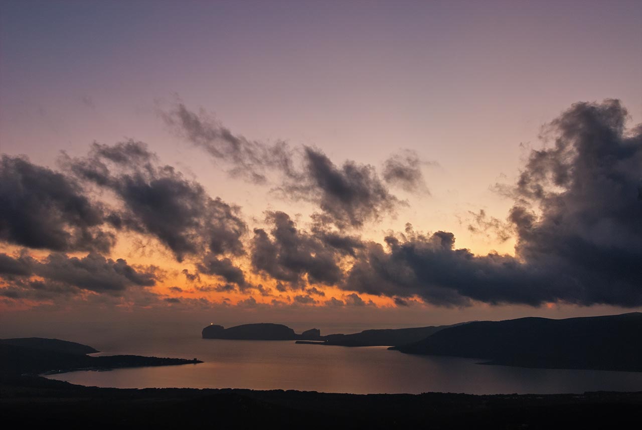
An image where it is not necessary to adjust white balance. On the left the original file, on the right the average, a blend of all the corrections sent by the participants in the Workshop.
After our preliminary analysis we will be in one of these cases:
- The images doesn’t need a white balance adjustment
- The image requires a simple adjustment
- White balance is not an exact value, and colors can be considered corrected even though they can be a in a wider range (example: sunset)
- The image needs a complex and difficult white balance adjustment, due to multiple different illuminants, or multiple different color casts.
Let’s try to understand together how can we reach these conclusions. Let’s imagine we are looking at a new image. A quick gaze at first is needed to try to understand how many (and where) are the light sources. If it is only one (the sun outdoor, or a lighting bulb indoor) we can already exclude the last, more complicated, case. With just one light source we can now look for a neutral point, any object that we are sure is supposed to be grey will be fine. We can now use the white balance adjustment tool in a RAW processors by clicking on that object. If no grey is available we can look forward to known colors (like skin tones, greenery and so on).
Often, though, shooting conditions are quite peculiar, and require special attention, like when we shoot at dusk, or sunset, or heavy rain is approaching. In all these cases it is not recommended to use an automated tool, because we do not want to neutralise the light. A sunset is, and should be painted by warmer tones. How much yellows and oranges is a matter of experience and taste. I always recommend to be subtle at first, and with experience be more bold, when needed.
Making mistakes with white balance
Unlike with other qualities in an image, contrast for example, a mistake in white balance is often absolute, not relative. There is no way to easily quantify contrast, or sharpening, in an image. But it is very easy to measure a grey that is not neutral. Even more this issue, often, is overlooked at the beginning of the correction, and with later saturation increases can only get worse.
A color cast is an extraneous color that fights and opposes the colors in our image, a professional can easily spot and measure it, and remove it. The issue get even much more important when, instead that a single image, we consider a series. A catalogue, a project, a gallery, all the installations that will display our work side by side, need to have a severely checked and coherent white balance.
I looked in my archive for a photo that could give you the idea of a wrong white balance, but by very little. The original is displayed on the left, the shot is actually quite balanced, but it is difficult to evaluate for many, because foreground and background have different lighting conditions. On the right a version that, even without looking at the numbers, already is perceived as unpleasant. But if we measure colors and numbers, we understand that, actually, colors are just slightly wrong, the house stones are grey, when they should be a bit yellow. But the major issue here is the greens saturation in the background, something that is even more accentuated but the direct sun.
If we captured a scene multiple times, even someone not educated on photography and color correction will be able to spot the issues. Exactly what happens when, in a mall, we approach tens of tv screens that shows the same channel and image, but not the same colors. Working on a set of images requires additional steps, we need to define the white balance more precisely, setting a standard, and match the images against one another. This procedures can be one of the more complex, and time consuming, in the color correction industry, and is the essential part of quality control.
Multiple color casts
The white balance adjustment tool in a RAW processors is easy, simple, and available anytime in your workflow. There is, unfortunately, a subset of images where it is useless and frustrating. If two, or more, different light source lit the scene, then correcting colors can be very complicated. At first it is recommended try to continue editing in RAW, by using HSL colour adjustment first, and local adjustment. If all fail, Photoshop will be our only chance to balance the image. We need to be able to to read the image, and understand how these lights are affecting the scene, and where, before being able to correct the original. In the next image, for example, we will see a scene with two different light source, first the indoor kitchen light, and second the outdoor sun coming from the large window in the background.
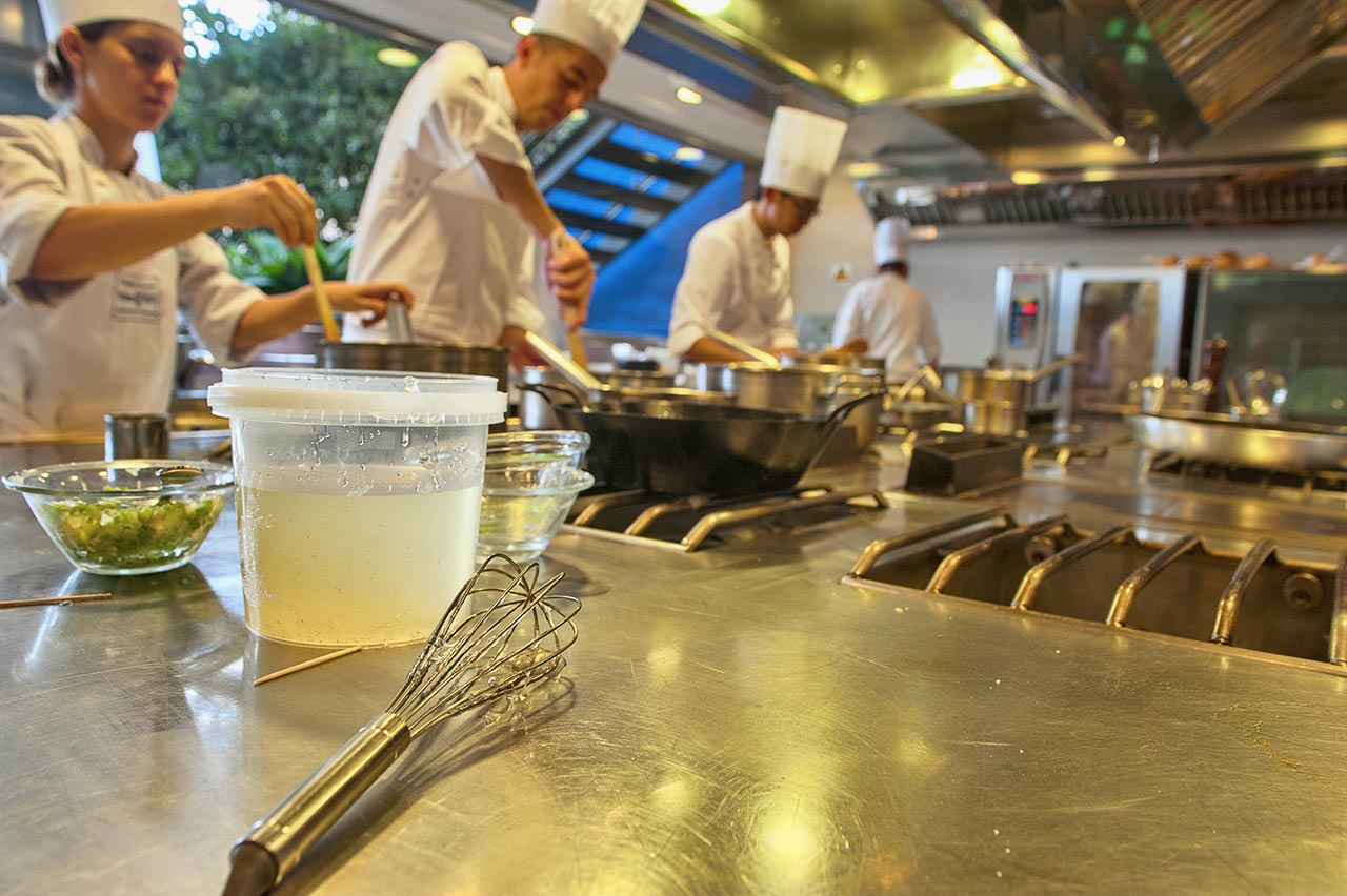
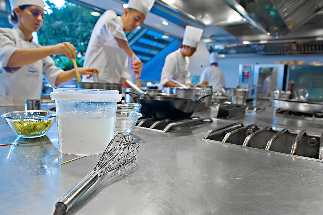
In this image we can see how ineffective is to balance only one light source, when there are two different or more. On the left one colorist chose to adjust the white balance on the outdoor light, leaving the steel table even more yellow than the original. On the right another colorist chose to balance the kitchen’s lights, something that shift the outside greens into blues.
If we measure colors in the scene we can see that the greenery outside the window is lacking in yellows. But, at the same time, adding more yellows everywhere would be a terrible idea, as it is easy to check that all the steel in the foreground has a severe yellow cast.
The differences between indoor and outdoor lights will force us to locally adjust the image. I chose this photo because the two zones are clearly defined, and one of them is not important at all. This image can still be corrected in a RAW processor, via the HSL sliders.
Unbalancing an image colors
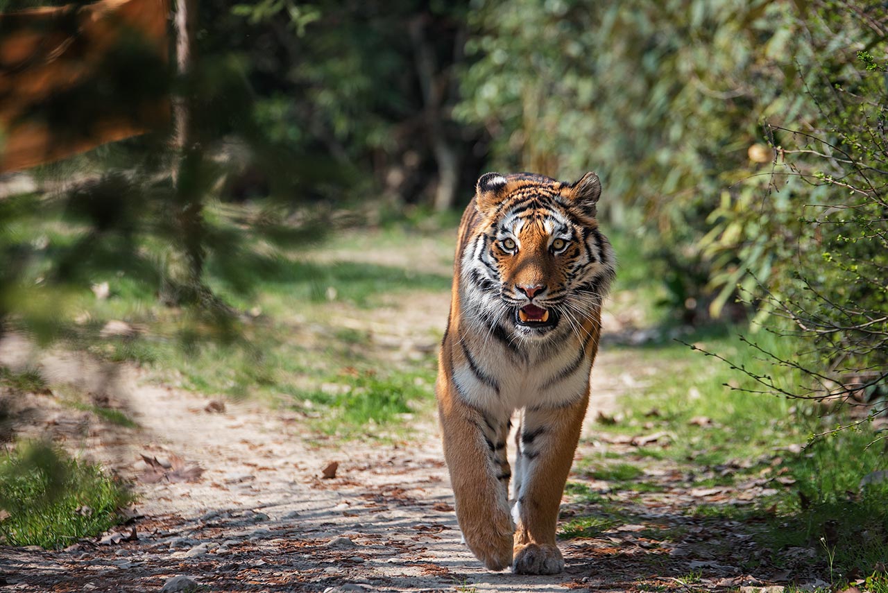
Analysing the chromatic component in an original is mandatory. But sometimes we can take some risks. Intentionally and carefully offsetting some colors in limited areas of a photograph can be accepted, if not recommended. The next image is a good example. Reading the tiger colors shows that in the whitest part of the fur yellows and greens are present. Yellows are actually reasonable in a wildlife animal, but greens need to be taken care of. I prefer, below, not to show you the original, but the average made by blending all versions from the Workshop Online.
After removing the green, a color that is rarely pleasant on animals, we can counter the yellows, and add a tiny amount of blues in the whites, to increase chromatic variance and simultaneous contrast, and let the fur’s orange tones shine even more.
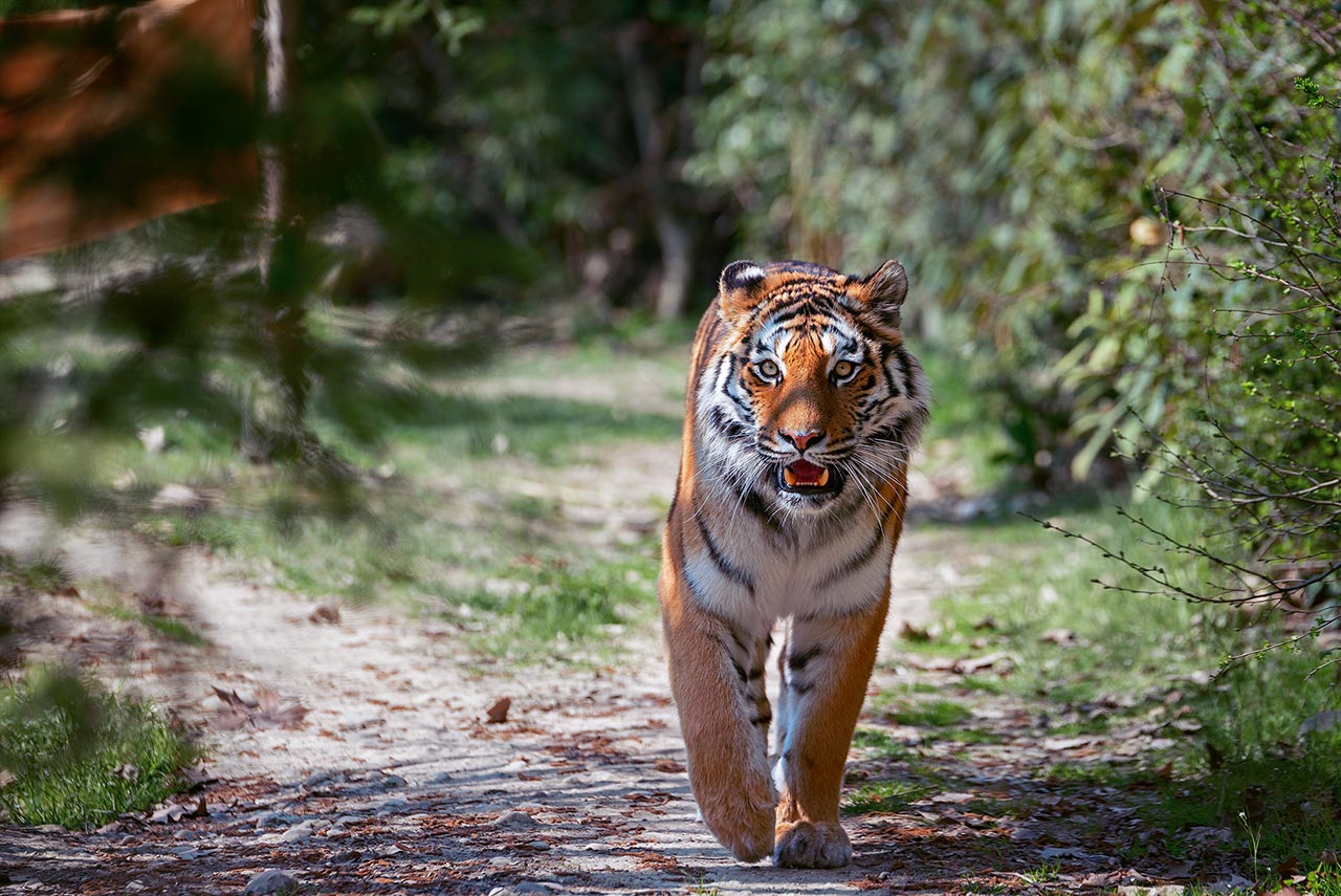
Finally, an example of how, sometimes, shifting the correctness of some colors may benefit to our perception. On the left the average version, made with all the versions sent by the Workshop’s colorists, on the right Steve Jordan’s version, with just a small amount of blue in the fur’s whites, that improves the chromatic variance, and the general image.
conclusions
Analyse white balance is a common step for every image. Adjustment is required almost every time we correct. Usually it is one of the easiest corrections to apply, and this is why, when wrong, it is an unforgivable mistake.